
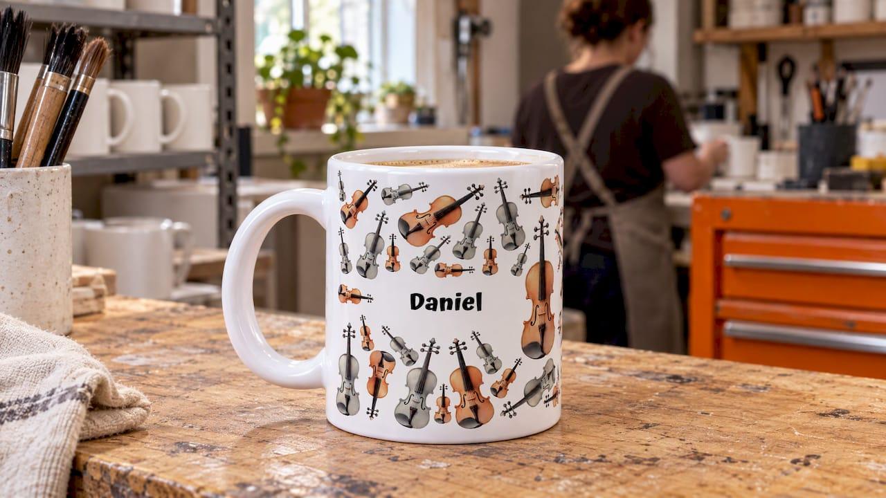
The best place for a name on a mug is on the main face opposite the handle, set slightly off true centre and kept clear of the handle edges. For a name that must read for left- and right-handed drinkers, repeat it on both sides. Long, hyphenated or phonetic names need a little more planning, and this guide covers each case. If you would rather not work it out alone, our personalised music mugs are built around names, instruments and gift messages.
TL;DR
- Put the name on the face opposite the handle, and keep it well away from the zones either side of the handle.
- Repeat the name on both faces if the mug will be used by both left- and right-handed people.
- Long names go on two lines, not one stretched line. Hyphenated names should stay together on one line wherever possible.
- Show a phonetic spelling in smaller type directly beneath the name, never instead of it.
- Check the spelling letter by letter, including hyphens and accents, before you confirm the order.
Table of Contents
- Why placement matters more than it seems
- Where a name sits in relation to the handle
- One side or both sides?
- Balancing the name with other artwork
- Long names on mugs
- Hyphenated names
- Showing a phonetic spelling
- A final spelling check before you order
- Quick reference by situation
- Promo: a mug built around a name
- Our perspective
- FAQ
- Sources
Why placement matters more than it seems
A mug is a curved object with an interruption in it. A flat screen design that looks perfectly balanced can turn awkward once it wraps around a cylinder and meets a handle. The name is usually the one element nobody can afford to lose, so it deserves the best position on the mug.
Three things decide how a name looks in real life:
- Where the handle sits. The handle hides or distorts anything that lands close to it.
- Who is holding the mug. A right-handed drinker sees one face while sipping, a left-handed drinker sees the other.
- What else is on the mug. An instrument sketch, a quote or a music-theory pattern competes for the same space as the name.
Good placement is mostly about deciding which of these matters most for the person receiving the mug, then building the layout around it.
Where a name sits in relation to the handle
The default: opposite the handle
For a single-sided design, the usual starting point is to centre the artwork on the side opposite the handle. It is the face people see when the mug is on a desk, a piano lid or a kitchen counter with the handle turned towards the drinker.
There is a catch. A design centred opposite the handle looks right in a straight-on product photo, but in use the drinker holds the handle and that face turns sideways. This is why many designers nudge the name slightly off the dead centre line, or repeat it on the other face, rather than trusting the preview alone.
Keeping clear of the handle zones
The area immediately beside the handle is the danger zone. Text that sits too close can look cut off, and the name may curve away from the viewer just where the eye expects it to be readable. Practical guidance from printing guides varies on the exact margin: figures such as roughly 1.5 to 2 inches (about 4 to 5 cm) from the handle are commonly quoted, and some guides stress that no single distance suits every mug shape or design width.
The lesson is not to chase one number. Instead:
- Mark a handle-side "no-go" zone on your layout and keep letters out of it.
- Leave extra breathing room near the left and right edges of the printable area.
- If you keep nudging the name away from an edge, increase the margin rather than hunting for perfect centring.
- Keep the margin the same from mug to mug if you are ordering a matched set, so the whole set looks consistent.
For the exact printable area on a music mug, our guide to mug print area sizes explains the canvas, and the handle itself is covered in our notes on handle comfort.
Does mug size change the answer?
Yes. A larger mug gives a name more room before it reaches the handle zones, while a smaller mug makes margins tighter. If your name is long, the extra surface can decide the layout. Our comparison of 11oz and 15oz mugs by print area shows how much difference that makes.
One side or both sides?
This is the question that catches most first-time buyers out. A mug has two main faces, and a drinker sees only one at a time.
One side only works when:
- The mug is mainly for display, or for one known person whose handedness you know.
- The name is paired with a large illustration, such as a violin sketch, and you want the artwork uncluttered.
- You want a single, confident statement rather than a repeat.
Both sides works when:
- The mug is a gift for someone whose handedness you are unsure of.
- The name is the whole point, as with a teacher's mug or a mug for a student's first recital.
- You want one face for the name and the other for a related graphic, a quote or a short message.
A common and effective split is the name on one face and the instrument illustration or quote on the other. The drinker gets a name no matter which hand they use, and the second face carries the personality.
If your design is a full wraparound pattern, such as sheet-music motifs or a repeating rhythm pattern, the name needs even more care, because a continuous design can swallow it. Our article on two-sided versus wraparound printing helps you choose, and our left-handed mug design checks explain what changes when the handle sits in the other hand.
Balancing the name with other artwork
Music mugs rarely carry a name alone. A typical order might combine a name with a trumpet sketch, a joke about improvising, or a piece of notation. A few rules keep the layout calm.
Give the name a clear rank. Decide whether the name is the headline or a signature. A headline name sits large and central. A signature sits small beneath or beside the illustration, rather like the name at the bottom of a painting.
Do not make everything the same size. If the name, the quote and the drawing are all competing, the mug looks busy. One element should clearly lead.
Respect the edges. Borders and busy edges make small print shifts more visible. A name close to a printed border can look crooked even when it is technically centred.

Preview it at real size. On screen, a mug design is a flat rectangle. Imagine it wrapped around a cylinder, with the handle hiding a section. Turning the mental picture 30 to 60 degrees, as you would when picking the mug up, shows quickly whether the name still reads.
When a photo is part of the design, resolution matters as much as position. Our guide to custom mug photo resolution covers sizes and checks.
Long names on mugs
A long name is the most common cause of a disappointing layout. The temptation is to shrink it until it fits on one line. The result is small, hard to read across a desk and visually weak.
Better options:
- Split it over two lines. A first and a last name stack naturally, with the first name slightly larger if you want emphasis.
- Use both faces. Put the first name on one face and the full name or title on the other.
- Shorten sensibly. A nickname or first name plus an initial can be warmer than a full formal name, and often more personal.
- Choose a bigger mug. More width means larger letters.
There are practical limits on how many characters fit comfortably. Our guide to character limits for personalised mugs gives typical ranges for names and for lines of text, so you can judge before you design.
Two names on one mug, such as a duet partner and a teacher or a couple who play together, bring their own layout questions. See our piece on two names on a mug for layouts that keep both names equal.
Hyphenated names
Hyphenated and double-barrelled names cause two separate problems: how the name is written, and how it breaks across lines.
Writing it correctly
In the UK a double-barrelled surname may be written with a hyphen, with a space or as one word, and the hyphenated form is the most common style. Because a hyphen removes ambiguity, the person's own preference is the only rule that matters. Ask how they write it, then copy it exactly, including capital letters on both halves.
Positioning it
- Keep it on one line if it fits. A name such as Smith-Jones reads as a single unit. Splitting it at the hyphen can make it look like two separate people.
- If it must break, break at the hyphen. Put the hyphen at the end of the first line so the reader knows the name continues, and never split in the middle of a half.
- Keep both halves the same size. Making one half smaller changes the name's meaning visually.
- Mind the hyphen near the handle. A small hyphen is easy to lose when it lands in the curve beside the handle. Keep it well inside the safe area.
For first names with a hyphen, such as Anne-Marie or Jean-Luc, the same rules apply: one line, same size, capitalise as the person does.
Showing a phonetic spelling
Some names are mispronounced so often that their owner has made a joke of it. A phonetic spelling on a mug can be affectionate and funny, and it suits the dry humour many musicians enjoy. It only works if it is legible and clearly secondary.
The layout that works:
- The name in the main size.
- The phonetic version in smaller type directly beneath, usually in brackets or between slashes.
- Optionally, a short line in the style of a dictionary entry, with the part of speech, for example "noun: a person who improvises".
Tips:
- Use plain respelling that anyone can read, such as "SHAV-awn", unless the recipient is a linguist who would enjoy true phonetic symbols.
- Stress is usually shown by capital letters or bold text on the stressed syllable. Check that your chosen style survives printing at small sizes.
- Keep the phonetic line at least a few millimetres clear of the handle zone, because small text is the first thing to look cramped.
- If the pronunciation is the joke, give it the whole second face. If the name is the point, keep the phonetic line small.
A music angle works nicely here: a name "defined" like a musical term, with a tempo marking or a dynamic marking next to it, turns a pronunciation guide into a gift.
A final spelling check before you order
A misspelt name is the one error that cannot be fixed after the mug is made. Before confirming any design:
- Read it letter by letter, aloud. Eyes skip over familiar words, so slow down and read each character.
- Compare against a reliable source. A message from the person, a card or an email signature is better than memory.
- Check hyphens, apostrophes and accents. O'Connor, Zoë and Anne-Marie are each easy to get slightly wrong.
- Check capitalisation. McDonald, DeVries and van der Berg are all written differently by different families.
- Check every face. If the name appears on both sides, check both.
- Ask a second person to look. A fresh pair of eyes catches what you stopped seeing.
- Put the spelling in writing. When ordering, type the name exactly as it should appear, rather than relying on a description.
Quick reference by situation
| Situation | Best placement |
|---|---|
| Short name, one large illustration | Name beneath or beside the illustration, opposite the handle |
| Gift, handedness unknown | Name on both faces |
| Long full name | Two lines, or first name on one face and surname on the other |
| Hyphenated name | One line, both halves equal, hyphen well clear of the handle |
| Phonetic joke | Name large, respelling smaller directly beneath |
| Name plus quote | Name on one face, quote on the other |
Promo: a mug built around a name
If you want the layout handled by people who design for musicians, our personalised music mugs combine custom instrument illustrations, music quotes, names, photos and gift messages. You can browse the instrument designs, funny music mugs, music theory patterns and composer mugs in the personalised music mug collection, or start with a personalised instrument sketch mug.

For present ideas by recipient, our best personalised music mugs for gifts page is a good next stop.
Our perspective
A name on a mug is a small act of recognition. When a violinist or a drummer picks up a mug with their name beside a sketch of their own instrument, the mug stops being crockery and becomes theirs.
That is why we think placement deserves as much attention as the drawing. A name hidden by the handle, or squeezed into a corner, undoes the thought behind the gift. We design with the name as part of the composition, not as an afterthought stamped on top.
Our focus is music: instrument illustrations, quotes with a wink, and names, photos and gift messages that make a mug feel commissioned rather than mass produced. If you are choosing a gift for a teacher, a student or a bandmate, start with what they would smile at, then let the name sit where it can be read.
Lasse
FAQ
Which side of the mug should a name go on?
For a single-sided design, put it on the face opposite the handle, which is the standard starting position. If the mug may be used by a left-handed person, or you are not sure, put the name on both faces so it faces outward whichever hand holds the handle.
How close to the handle can a name be?
Keep it well clear. Printing guides commonly suggest around 1.5 to 2 inches (roughly 4 to 5 cm), but the right margin depends on the mug and design width. Treat the area beside the handle as a no-go zone and increase the margin if the name looks cramped.
How do I fit a very long name on a mug?
Split it over two lines, spread it across both faces or use a larger mug. Shrinking it onto one line makes it hard to read. Our character limit guide gives typical ranges.
Should a hyphenated name be split across two lines?
Only if it will not fit on one. If it must break, split at the hyphen, keep both halves the same size and make sure the hyphen is not hidden near the handle.
Can I add the pronunciation of a name to a mug?
Yes. Put the name in the main size and the phonetic respelling in smaller type directly beneath it, in brackets or between slashes. Keep the respelling simple and clear of the handle.