
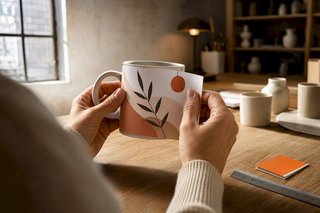
A left-handed mug places its main design so it faces outward when held in the left hand, with the handle sitting where a left-hander's fingers naturally rest. The simplest fix for most buyers is to order a faces-out left-hand variant if one exists, or sidestep the whole issue with a double-sided or full-wrap design that reads correctly regardless of which hand picks it up.
TL;DR:
- Proper placement of design and text depends on the handle position, which should be verified by holding a mug at nine o'clock and three o'clock to avoid orientation errors.
- Roughly 10% of the population is left-handed, meaning ignoring left-handed variants risks placing the design facing inward for a significant minority.
- Designing for the left hand involves reversing artwork placement, marking safe print areas, and considering curvature distortion to ensure clarity and correct orientation.
- Double-sided or full-wrap designs are recommended for gift sellers to eliminate handedness issues and accommodate recipients of unknown dominant hand.
- Proper handling, including checking handle angle and verifying details in photos and mockups, reduces mistakes and ensures the design faces outward for left-handed users.
Table of Contents
- What does "left-handed mug design" actually mean?
- How do you design and print a left-handed mug correctly?
- Does the handle shape actually matter for left-handers?
- Should you go ambidextrous instead of picking a side?
- How does the Mugnificent Deals studio check for left-hand accuracy?
- What common mistakes ruin left-handed mug designs?
- What do popular left-handed mug designs look like in practice?
- Why small brands should default to left-hand aware design
- Order a left-handed mug design that actually gets it right
- Sources
- FAQ
What does "left-handed mug design" actually mean?
Most mugs are designed with one assumption baked in: the drinker holds the handle with their right hand, so the artwork sits opposite it, ready to face outward. That is a faces-out design for right-handers. Turn that same mug into a left hand and the picture, quote, or name now faces the drinker's chest rather than the room. A true left-handed mug flips the artwork so it faces out when the handle is gripped by the left hand instead, which typically means the design sits roughly where a right-hander's mug has its blank back panel.
Sellers describe this a few different ways, and the terminology genuinely matters when you are choosing a variant online:
- Faces-out (right-hand default): the standard orientation on almost every mass-produced mug; design shows when held right-handed.
- Faces-out (left-hand): the design mirrors position so it shows when held left-handed; this is what most people mean by a left-handed mug.
- Faces-in: the design ends up pointing towards the drinker rather than outward, usually an unintended result of using a right-hand mug in the left hand.
- Ambidextrous or double-sided: the same artwork (or two versions) printed on both sides, so orientation stops being an issue entirely.
A useful mental shortcut is to think of the handle as sitting on a clock face. On a right-hand mug held to drink, the handle points to roughly nine o'clock and the design faces the room. Give that same mug to a left-hander and the handle now needs to sit near three o'clock for the design to face out correctly, which is the whole reason handedness matters in mug printing at all.
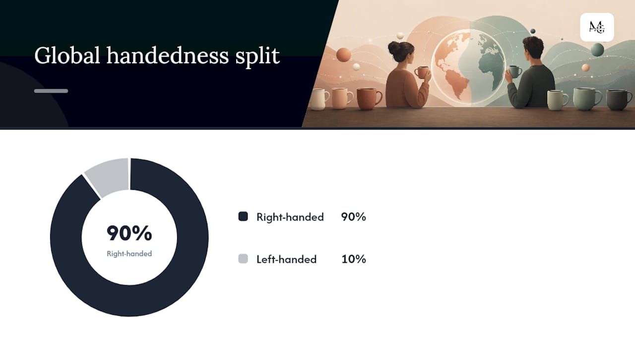
This is not a niche concern. Around 10% of the global population is left-handed, which on any reasonably sized gift list means at least one person is holding their mug the "wrong" way round unless the design accounted for it. For personalised gifts, especially ones bought for a specific named person, that one-in-ten chance is worth checking rather than ignoring.
How do you design and print a left-handed mug correctly?
Getting the placement right is less about artistic skill and more about a repeatable checking process. Industry convention places artwork opposite the handle to create a faces-out look for right-handers; for a left-handed coffee cup, you simply reverse that logic and design as if the handle were on the other side.
Here is the process that keeps that reversal from going wrong:
- Pick your reference orientation first. Decide whether you are designing for right-hand faces-out, left-hand faces-out, or a double-sided layout, before you open any design software. Changing your mind halfway through a layout is how mistakes creep in.
- Use the handle-as-compass proof. Hold a physical mug (or a mockup) with the handle at nine o'clock and check what faces the room; then mentally rotate it so the handle sits at three o'clock and check again. This quick proofing technique catches orientation errors before they reach production.
- Mark your safe print area. Curved ceramic surfaces distort artwork near the handle seams, so keep critical text and faces away from the 1 to 2 centimetres closest to the handle join on either side.
- Size text for in-hand viewing, not screen viewing. A quote that looks perfectly legible on a flat digital mockup can shrink to an awkward size once wrapped around a 9 to 11cm diameter mug body.
- Choose your finish and confirm production specs by selecting the right blank, such as a white glossy mug, to ensure optimal print quality and material suitability. Ceramic blanks vary in size and print area, so choosing between 11oz and 15oz affects how much room your design actually has to work with. Confirm the printer's recommended DPI (300 is standard for sublimation) and colour profile before sending final files.
Photo mugs and text mugs behave differently on a curved surface. A photo, particularly a face or a full scene, tends to distort at the edges of a wrap, so centring it within a safe zone rather than stretching it around the whole mug usually looks cleaner. Text is more forgiving of a partial wrap but needs higher contrast against the mug colour than it would on paper, since ceramic glaze reflects light differently to matte print stock. Designing for how the mug will actually be held and viewed, rather than how it looks flat on a screen, consistently produces better results than optimising purely for the product photo.
Deciding between a single faces-out design and a full wrap comes down to the content. Patterns, repeating motifs, and abstract designs suit a wrap well because there is no single "wrong" viewing angle. A moderate wrap or centred panel performs reliably for most single-subject designs, while a full wrap of a photograph or portrait needs careful composition to avoid splitting a face or cropping a name awkwardly near the handle. When in doubt, double-sided printing removes the guesswork altogether, at the cost of a slightly higher production step.
Pro Tip: Before approving any left-handed mockup, print it flat on paper at actual size, wrap it around a real mug of the correct diameter, and hold it in your left hand exactly as a customer would. Screen previews lie about curvature far more often than people expect.
Does the handle shape actually matter for left-handers?
Yes, though less than orientation does. Most standard mugs use a symmetrical C-shaped handle, which works reasonably well for either hand because the grip angle does not change much whether you approach from the left or right. Where it gets more interesting is with offset or angled handles, sometimes used on ergonomic or novelty designs, which can force the wrist into a slightly rotated position for one hand and a relaxed one for the other. Human factors research on affordances confirms that handle geometry actively shapes how someone grips and orients an object, not just how comfortable that grip feels.
Travel mugs and lidded cups raise a separate issue: the sipping spout or lid seam is usually positioned for a right-hand hold, and a left-hander using it as-is may find the seam pressing against their lip or the lid pointing away from where they naturally tilt the cup. Some travel mug designs solve this with a rotatable lid that clicks into either orientation, which is worth checking for if the mug in question is one that travels rather than sits on a desk.
A few quick checks before buying or approving a design:
- Hold a sample (or a similarly shaped mug you already own) in your left hand and check whether the handle angle feels natural without twisting your wrist.
- If it has a lid, check whether the spout or seam rotates independently of the handle.
- Look at product photos closely. A genuine left-hand product photo should show the handle on the correct side for a left-hand grip, not a mirrored right-hand shot.
- If buying as a gift, ask the recipient (or someone who knows them well) whether they have ever mentioned mug orientation being an issue. Not everyone notices, but the people who do notice tend to mention it often.
Pro Tip: If you're testing handle comfort yourself, fill the mug with water rather than testing it empty. Weight changes how a handle feels in the hand far more than most people expect, particularly with offset or angled designs.
Should you go ambidextrous instead of picking a side?
For gift buyers especially, yes, and it is usually the safer default. Double-sided printing or a well-planned full wrap neutralises the handedness question entirely, because the design shows correctly no matter which hand holds the handle. This matters most when a mug is being bought for someone else, where you might not know or remember their dominant hand, or when a design is intended as a bestseller for a wider audience rather than one specific person.
The trade-off is production complexity. Double-sided printing usually means either two passes on the printer or a design split cleverly across a wrap, and not every design translates well into two mirrored halves. A single striking image or a short, punchy quote tends to double-side better than a busy multi-line paragraph, which can end up feeling cramped when split.
Before ordering, run through this checklist:
- Check for an orientation icon or diagram on the product listing. A left-hand icon or an explicit "faces out when held in left hand" description is a strong signal the seller actually thought about this, rather than just mirroring a stock template.
- Look for a genuine left-hand mockup photo, not a flipped right-hand image. Genuinely photographing a left-hand sip rather than mirroring an existing shot avoids subtle errors like a logo reading backwards.
- Confirm care instructions. Most personalised ceramic mugs are dishwasher safe on a top rack and microwave safe, but sublimated designs can fade faster with aggressive dishwasher detergents over years of use.
- Check the return or exchange policy specifically for personalised items, since many sellers restrict returns on customised products once printed.
- Read the print area description, not just the photo, to confirm whether the design wraps, is centred, or sits opposite the handle.
Left-handers make up roughly 10% of the population, which means a seller stocking only right-hand faces-out designs is, on average, getting the orientation wrong for one in every ten buyers who care about it.
For where to actually look, the market splits fairly cleanly into three types of destination. General marketplaces like Etsy UK carry a wide range of independent sellers, some of whom offer left-hand variants explicitly and others who do not offer the option at all, so reading the listing description carefully matters more than browsing categories. Amazon.co.uk tends to surface mass-produced designs where left-hand options are rarer and usually need a specific search term to find. Specialist brands built around the concept, such as HIDARI, design purpose-built left-handed mugs from the ground up, with left-facing logos as the default rather than an afterthought, which is a useful reference point for what a genuinely considered left-hand product looks like. Personalised sellers, including studios that focus on custom or gift mugs, sit somewhere between the two: less product breadth than a marketplace, but more scope to request the orientation you actually need.
How does the Mugnificent Deals studio check for left-hand accuracy?
Getting orientation right on a personalised item is harder than on a mass-produced one, because every design is different and there is no template to fall back on. Lasse and the team behind Mugnificent Deals build handedness checks into the workflow for exactly that reason, since a beautifully drawn violin sketch means little if it ends up facing the wrong way for the person receiving it.
Two checks run on every design that has a handedness-sensitive layout:
- The handle-as-compass proof, described earlier: mentally (or physically) rotating a sample mug to confirm the design faces out at both the nine o'clock and three o'clock handle positions before approving artwork.
- The left-hand sip test, where a genuine left-hand grip is photographed rather than a mirrored right-hand image, catching errors like reversed text or a logo that reads backwards once flipped.
A short photography checklist backs both of these up: shoot the handle on the correct side for the stated orientation, include a hand actually holding the mug where possible, and label the listing clearly rather than relying on the customer to infer orientation from a photo angle. This mirrors the broader industry finding that showing an actual left-hand sip in product photography reduces buyer confusion far more effectively than a paragraph of description ever does.
For anyone curious about the ergonomics side of this in more depth, the studio's own notes on handle comfort research go further into grip geometry, and the design workflow for music mugs covers how photo and text choices interact with print placement more broadly.
What common mistakes ruin left-handed mug designs?
The single biggest error is mirroring a right-hand mockup without checking it against a physical mug. A design that looks correctly flipped on screen can still end up facing the wrong way once wrapped around actual curved ceramic, because screen mockups rarely account for how the handle seam interrupts the print area.
A close second is assuming symmetry where none exists. Handles with even a slight offset, or lidded travel mugs with a fixed spout, do not behave the same way in both hands, and treating them as interchangeable leads to a design that technically faces out but sits at an awkward angle to actually read comfortably.
Text placement causes its own set of problems. Designers sometimes centre a quote or name directly opposite the handle without accounting for how much of that panel disappears into the curve near the rim and base, leaving letters that look fine in a flat proof but stretch or crop oddly once printed. Similarly, using a font that is legible at a large flat size but too fine once shrunk to fit a curved panel is a recurring issue with quote mugs specifically.
Finally, sellers frequently list a left-hand variant with a photo that is simply a horizontally flipped right-hand image rather than a genuine left-hand photograph. This can leave text, logos, or watermarks reading backwards in the listing photo itself, which undermines buyer confidence even when the actual product would print correctly.
What do popular left-handed mug designs look like in practice?
The most successful left-handed designs tend to share one trait: they were planned for the orientation from the start, not adapted afterward. A hand-drawn instrument sketch, for instance, works particularly well as a left-hand faces-out design because a simple line illustration has no directional text to worry about getting mirrored or backwards.
Short, punchy text mugs, things like a single witty line or a musician's inside joke, adapt well to left-hand orientation because there is little content to reposition and the whole design can simply shift to the opposite panel without losing impact. Name mugs and initials follow the same logic, since a name reads the same whichever side of the mug it sits on, as long as the letters themselves are not flipped.
Full-wrap pattern designs, musical notation repeated around the mug or a stave motif, sidestep the whole handedness question by design, which is part of why patterns and repeating motifs remain a dependable choice for gift sellers uncertain of the recipient's dominant hand. Photo mugs are the trickiest category to get right consistently, since a genuine left-hand photo mug needs the subject composed with enough margin to survive being shifted to the opposite panel without cropping a face or cutting off part of the image near the handle join.
Why small brands should default to left-hand aware design
Most mug sellers never think about handedness until a customer complains, and by then the damage is done: a personalised gift that arrived facing the wrong way is not something you can quietly fix after the fact. Building the check in from the start costs almost nothing extra and pays back in fewer returns and better reviews.
The operational fix is smaller than it sounds. Adding a simple orientation icon to a product listing, or defaulting bestsellers to double-sided printing, removes the guesswork for the customer entirely. It signals, without saying so directly, that the seller actually thought about who might be holding the mug. That is a low-cost signal of care that most competitors still skip, and it is precisely the kind of detail that turns a one-off gift purchase into a repeat customer.
— Lasse
Order a left-handed mug design that actually gets it right
Every personalised design has orientation checked before it goes anywhere near a print run, so you are not left guessing whether a gift will face the right way in someone's left hand. That matters most with hand-drawn instrument sketches, musician in-jokes, and names that need to read correctly however they are held.
If you already know the recipient is left-handed, mention it when you order and the design may be adjusted around it rather than mirrored as a stock template after the fact. Unsure, or buying for a group of music-loving gift recipients with mixed handedness? A double-sided or wrap layout from the personalised music mugs collection sidesteps the issue completely, and the best personalised music mugs for gifts selection is built with exactly that kind of flexibility in mind. For something more specific, the instrument personalised sketch mugs range shows how a single hand-drawn illustration adapts cleanly to either orientation. Browse the collection and note your preferred hand orientation at checkout.
Sources
For readers who want to check the figures and design guidance directly: the left-handed population statistic comes from WorldAtlas, practical orientation and photography guidance from Vancasso Tableware, print layout advice from PrintMugs UK, and handle affordance research from PubMed Central.
- What percentage of the world population are left‑handed? | WorldAtlas
- Left‑Handed coffee cup: an inclusive design guide | Vancasso Tableware
- How to design a branded mug that people actually use | Bulk Branded
- Custom mug design: fonts, colours & layouts | PrintMugs UK
- Relevant affordances and attention studies | PubMed Central
FAQ
Is there such a thing as a left-handed mug?
Yes. A left-handed mug is designed so its main artwork faces outward when the mug is held with the handle in the left hand, the mirror image of the standard right-hand faces-out layout most mugs use by default.
What is the difference between a right-handed mug and a left-handed mug?
The difference is which side of the design sits opposite the handle. A right-handed mug places the design so it faces out when the handle is gripped by the right hand; a left-handed mug reverses that placement so the same design faces out for a left-hand grip instead.
Which side should mug design be on?
The design should sit opposite the handle in the direction the mug will actually be held, which depends on the intended user's dominant hand. Using the handle-as-compass proof (checking the design at both the nine o'clock and three o'clock handle positions) is the quickest way to confirm placement before ordering.
What are the mug trends for 2026?
Personalised, story-driven designs, hand-drawn illustrations, names, and inside jokes rather than generic slogans, continue to dominate gift-buying preferences. Alongside that, inclusive touches such as labelled orientation variants and double-sided printing are becoming a more visible differentiator among sellers who cater to gift buyers uncertain of a recipient's handedness.