There is something quietly frustrating about receiving a mug that could belong to anyone. Generic slogans, stock clipart, and forgettable fonts do very little to capture what it actually means to spend hours in a practice room, carry a heavy instrument case across campus, or feel that particular thrill when a difficult passage finally clicks. Music students deserve better than that. A well-designed, personalised music mug can sit on a desk, cradle a late-night coffee, and serve as a small daily reminder of identity and purpose. This guide walks you through every step of designing one that genuinely stands out.
Table of Contents
- What makes a great music mug design?
- What you need: tools and materials for mug design
- Step-by-step: designing your music mug
- Common pitfalls and how to avoid them
- Comparing mug design approaches for different student personalities
- Why thoughtful design trumps novelty for music mugs
- Ready to make your music mug idea a reality?
- Frequently asked questions
Key Takeaways
| Point | Details |
|---|---|
| Prioritise clarity | Designs with a clear focal point and bold contrast work best on curved mugs. |
| Personalisation matters | Adding a student’s name or instrument makes the mug meaningful and memorable. |
| Choose print method wisely | Match your design and budget to the production technique for best results. |
| Avoid common mistakes | Check readability, avoid clutter, and use legible fonts for a professional finish. |
| Make it last | Thoughtful, well-executed designs outshine novelty and stay cherished for years. |
What makes a great music mug design?
Having set the scene with why personal mugs make an impact, let's uncover what actually makes a music mug design special and effective.
Great mug design is not about packing as much information as possible onto a curved surface. It is about making one strong visual statement that lands immediately. Think of it like the cover of a well-loved sheet music book: clear, distinctive, and instantly recognisable.
Three core ingredients drive every successful music mug design:
- A dominant visual focal point. Whether it is a line drawing of a violin, a bold treble clef, or a cartoon drum kit, one image should anchor the whole composition.
- Personalisation that feels specific. A student's name, their instrument, their ensemble or music school adds meaning that no mass-produced mug can replicate.
- Readability from a distance. Good music mug design examples prove that legible type and confident contrast matter more than intricate detail.
According to ceramic mug printing artwork rules, the guiding principle is to design for readability at arm's length and avoid clutter. On a mug, you are rarely looking at the design from inches away. Spacing, contrast, and simplicity are the real heroes.
Common mistakes to avoid at the first draft stage:
- Using three or more competing fonts
- Placing too many small graphics that blur on the curved surface
- Choosing light text on a pale background
- Writing long paragraphs of text that wrap awkwardly around the mug
The following table compares design approaches that tend to succeed versus those that struggle:
| Design approach | Likely outcome | Why it works or fails |
|---|---|---|
| Single instrument icon plus name | Very effective | Clear focal point, personal detail |
| Music note border plus quote | Effective | Organised, readable from distance |
| Multiple small icons all over mug | Risky | Feels busy, details can blur |
| Dense paragraph of text | Poor | Wraps badly, hard to read |
| Monogram plus instrument silhouette | Very effective | Elegant, instantly personal |
For further inspiration, browsing unique mug concepts offers a practical catalogue of approaches that balance simplicity with genuine personality. The best designs feel considered, as though someone sketched them on a notepad before committing them to ceramic.
What you need: tools and materials for mug design
Now that you know what distinguishes a great design, let's get practical and assemble the right tools and techniques for the project.
The good news for students on a budget is that you do not need expensive software or professional printing equipment to create something impressive. Many of the most effective music mug designs start life as a simple sketch or a quick digital file assembled in a free online tool.
Essential tools and materials:
- Design software: Free options like Canva, Inkscape, or Adobe Express work well for beginners. Paid tools like Adobe Illustrator offer more precision for complex artwork.
- Mug templates: Most print providers offer downloadable template files that show the exact print zone dimensions. Always use these before submitting artwork.
- High-resolution assets: Musical symbols, instrument illustrations, and typography should all be at least 300 DPI (dots per inch) to print crisply.
- Ceramic blank mugs: If you plan to print at home using transfers, choose a white or light-coloured ceramic with a smooth glaze for the best results.
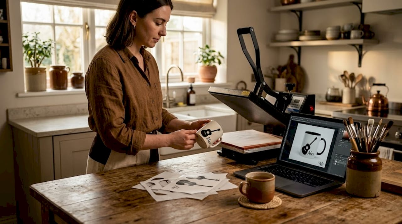
The overview of production methods available to music students covers the range from sublimation to screen printing in useful detail. Understanding the method before you design saves significant time.
Different production methods have notably different strengths. As explored in Printful's guide to mug printing, sublimation, UV digital, screen printing, heat transfer, engraving, and pad printing each trade off durability, print quality, and cost. Sublimation produces the most vibrant full-colour results and wraps seamlessly around the mug surface, but requires a polyester-coated blank. UV and digital printing are ideal for shorter runs with photo-level detail. Screen printing suits bold, flat designs in one or two colours and carries a lower per-unit cost at higher volumes.
Quick buying tips for students on a budget:
- Order a single test mug before committing to a batch
- Look for print-on-demand services that charge no minimum order
- Use vector graphics where possible as they scale without losing quality
- Keep your colour palette simple to reduce printing complexity
Pro Tip: If you are designing digitally, set your canvas to the exact dimensions of the mug's print zone, usually around 8.5 inches wide by 3 inches tall, so you can see precisely how your layout fills the space before sending it to print.
Step-by-step: designing your music mug
With all your materials and a clear idea of what to include, it is time to walk through the key design steps that result in a show-stopping mug.
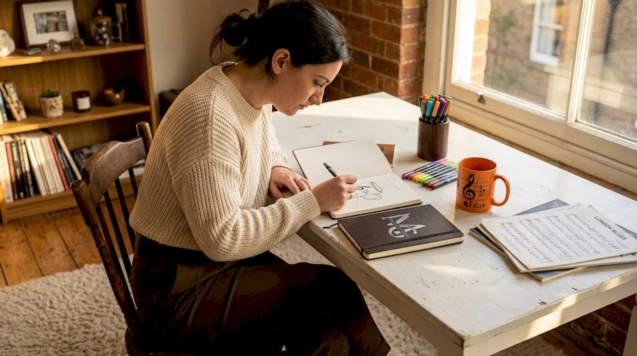
1. Define your concept before opening any software. Sketch on paper first. Decide which instrument, symbol, or music-related image will serve as your hero visual. Write down the text you want to include: a name, a course, a quote, or a playful caption.
2. Choose your dominant visual and keep it bold. Instrument silhouettes, treble clefs, music staves, and headphones all work well. Avoid detailed photographic images as they often lose clarity when wrapped around a curved surface and printed at mug size.
3. Select your typography carefully. Use no more than two fonts. One for the main name or headline, one for any secondary text. Sans serif fonts like Futura or Helvetica remain crisp on ceramic. Avoid ultra-thin scripts as a cautionary note.
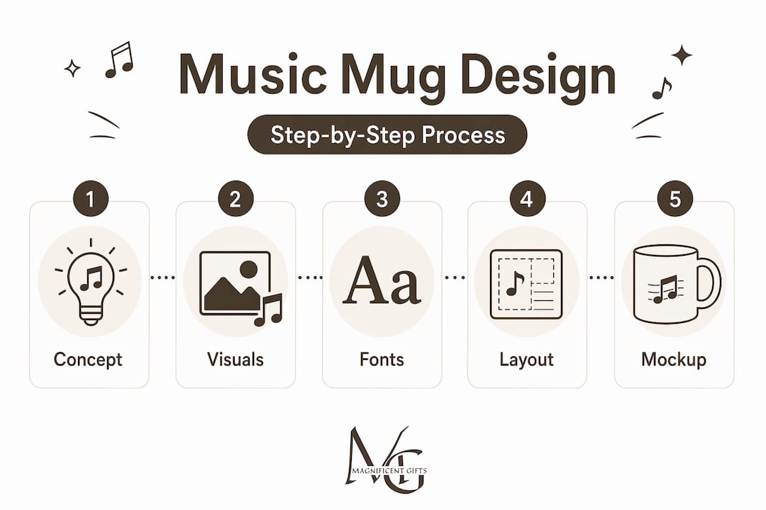
4. Arrange your layout using the print zone template. Ceramic mug printing artwork rules are clear: use simple, high-contrast artwork with a clear focal point and sufficient spacing. Leave at least 5mm clear around all edges of the print zone to avoid cutoff.
5. Check the wrap carefully before printing. According to sublimation mug guidance, the wrap area and press-sensitive edges require specific attention. Key graphic elements should sit in the central two-thirds of the mug's print area to avoid distortion near the handle seam.
6. Export in the correct file format. PNG files with a transparent background work well for most print providers. CMYK colour mode is preferred over RGB for printed output as it more accurately represents how colours will appear on ceramic.
"Design your mug as if someone will read it across a busy kitchen. If the main message doesn't land in under two seconds, simplify."
You can browse personalised music mug galleries to see how confident focal points and clean layouts translate onto actual mugs before you commit to your own design.
Pro Tip: Print a paper mock-up of your design at actual mug scale, wrap it around a cylindrical object, and hold it at arm's length. This simple trick reveals spacing and legibility issues that are easy to miss on a flat screen.
Common pitfalls and how to avoid them
Before hitting print, it pays to check for common traps that can ruin an otherwise brilliant design.
Most beginner mistakes fall into predictable categories. Recognising them in advance can save you from an expensive reprinting exercise.
The top five pitfalls:
- Overcrowding the surface. Adding five instruments, three quotes, and a border is tempting but overwhelming. Pick one message and execute it well.
- Poor font choices. According to Printmugs.uk's guide on font choices, sans serif or robust serif fonts remain the most legible options. Thin script fonts carry real risk as fine details disappear in the printing process.
- Ignoring the mug's physical shape. Text that looks perfectly balanced on a flat canvas can feel cramped or lopsided once wrapped around the cylinder. Always preview on a mug template.
- Using the wrong print zone. Most mugs have a defined printable area that excludes the handle side and a small margin at top and bottom. Artwork placed outside these boundaries will be clipped or distorted.
- Mismatched colours. Screen colours look different from printed colours. Always convert to CMYK and, if possible, request a physical proof before placing a large order.
"A clean design with one great idea will always outperform a busy design trying to say everything at once."
It is also worth reviewing what unique ceramic mug best practices look like in practice. Seeing polished examples of what works reinforces the principles described above in a concrete and inspiring way.
Comparing mug design approaches for different student personalities
For more targeted inspiration, let's see how you can tailor designs to each music student's style or personality.
Not every music student wants the same thing on their mug. A classical violinist and a jazz improviser have different sensibilities, and a thoughtful design acknowledges that. As Printful's design guidance confirms, practical music-student mug concepts work best with a dominant visual plus simple personalisation. The table below shows how this principle adapts across different student types.
| Student type | Suggested visual | Personalisation idea | Tone |
|---|---|---|---|
| The classicist | Detailed instrument line drawing | Name plus orchestra or conservatoire | Elegant, refined |
| The jazz lover | Abstract improvisation graphic | First name plus "plays it by ear" | Playful, witty |
| The band leader | Conducting baton silhouette | Title plus ensemble name | Authoritative, warm |
| The minimalist | Single musical note or rest symbol | Initial plus instrument | Understated, modern |
| The music teacher | Stave with notes | Name plus "teaching the next generation" | Proud, celebratory |
Design notes for each type:
- The classicist benefits from a black-and-white instrument drawing, subtle serif typography, and clean white space. Gold or navy accents add gravitas without flashiness.
- The jazz lover suits a loose, sketch-like graphic and a clever caption. Think of something like "I improvise, not mistakes" in a confident rounded font.
- The band leader responds well to bold typography, a confident icon, and their ensemble's name beneath their own. It doubles as a pride piece.
- The minimalist wants almost nothing on the mug. One symbol. One initial. Generous white space. Executed with precision.
For gift-giving ideas grouped by student type, the music mug gift inspiration collection provides ready-made starting points that can be further personalised with names and details.
Why thoughtful design trumps novelty for music mugs
Here is a perspective that is worth sitting with: novelty mugs get laughed at once, then quietly migrate to the back of the cupboard. It is a pattern most people recognise, even if they do not admit it openly.
The mugs that stay on desks, that get photographed alongside a score or an instrument, are the ones that felt genuinely considered. They show that someone understood the recipient's musical journey, not just the fact that they play music. There is a real difference between a mug that says "musician" in a generic font and one that features a carefully drawn cello with a student's name and conservatoire beneath it. The second one says, "I see exactly who you are."
This matters more than ever in a market saturated with print-on-demand novelty items. When everyone can produce something quickly, the meaningful differentiator becomes genuine thought and well-crafted execution. Chasing trending graphics or the latest meme-style caption often produces mugs that feel dated within months.
The more durable approach is to focus on long-lasting gift design: clear artwork, personal details that are specific rather than generic, and a tone that fits the individual rather than the trend. A music student who receives a mug designed with real attention to their instrument and their story is receiving something that functions as a small piece of memorabilia. That kind of object earns its place on the shelf for years.
Quality of execution also signals respect. A design where the contrast is right, the font is legible, and the image is crisp communicates effort. That effort is part of the gift itself.
Ready to make your music mug idea a reality?
You have the concept, the techniques, and the confidence to create something worth keeping. Now it is time to bring it to life.
At Mugnificent Deals, you can browse a curated personalised music mug shop that already thinks the way you do: one strong image, a personal touch, and a tone that earns a smile rather than demanding one. Whether you are designing a mug for yourself, a fellow student, or a teacher who deserves proper recognition, the range of gift-ready music mug ideas gives you a practical starting point. For something extra special, the music teacher gifts collection is full of designs that are already personalised in spirit and easy to make entirely your own.
Frequently asked questions
Which printing method gives the most vibrant colours on music mugs?
Sublimation and UV digital printing methods generally produce the brightest, most photo-quality colours, as confirmed by Printful's comparison of mug printing methods. Sublimation is particularly effective for designs that wrap fully around the mug surface.
How do I ensure my design is legible on a curved mug?
Use a single, high-contrast focal point and keep all text large enough to read comfortably at arm's length. PromotionChoice's artwork guidance specifically advises that mug text should be spaced and sized for curved reading distances.
Can I add both musical images and a name to my mug?
Yes, combining a dominant musical visual with a personalised name is one of the most effective mug design approaches. Printful's custom mug design guide confirms that successful music-student mugs consistently use a main visual paired with one personalised element for maximum impact.
What font is best for mug design?
Sans serif fonts and robust serif families are the safest choices for mug legibility. Printmugs.uk's typography guidance advises avoiding thin script fonts as fine details tend to disappear in the printing process, particularly on smaller text sizes.