
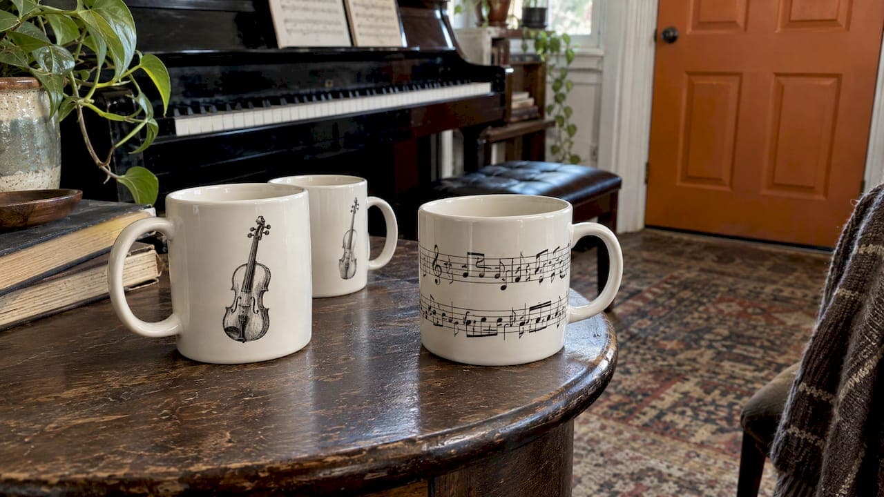
A two-sided mug carries two separate designs, one on each side of the handle. A wraparound mug carries one continuous design that runs round the ceramic and stops near the handle. Choose two-sided when you want a clear front and back, such as an instrument sketch on one side and a name or joke on the other. Choose wraparound when you have one panoramic image, a pattern or a long line of staves that should flow without a break.
This guide explains how each method behaves in practice, where the handle gap and seam fall, how to think about left- and right-handed drinkers, and which option suits a music-themed mug or gift.
TL;DR
- Two-sided print: two separate design areas, one either side of the handle. Best for a front and back, a drawing plus a message, or a mug that must look good whoever holds it.
- Wraparound print: one continuous design that travels round the mug. Best for panoramic photos, patterns, music notation and repeating motifs.
- The handle matters in both: there is always a strip of bare ceramic by the handle, so keep names, faces and key words well away from it.
- For music gifts: use two-sided for an instrument illustration with a personal line, and wraparound for a pattern, a score or a panoramic photo.
- Unsure of the recipient's drinking hand? A design that reads from both sides removes the guesswork.
Table of Contents
- The difference in plain terms
- Side-by-side comparison
- The handle gap and the seam
- Which side should a design go on?
- Which suits a music mug or music gift?
- How to set up a two-sided design
- How to set up a wraparound design
- Common mistakes with both methods
- Our perspective
- Choosing for a gift
- Explore personalised music mugs
- A final checklist before you order
- FAQ
- Sources
The difference in plain terms
Both methods use the same curved surface. What changes is how the artwork is divided up.
Two-sided printing treats the mug as two canvases. One design sits on the side facing you when the handle is on your right, and a second sits on the opposite side. The two can be identical, mirrored in layout, or entirely different. Because each side is its own file, you control each one separately, and the handle area between them stays clean.
Wraparound printing treats the mug as one long canvas. The artwork is a wide rectangle that is wrapped round the body, so its left and right edges meet near the handle. Nothing interrupts the image on the far side, which is why it suits scenes, skylines, patterns and panoramic photographs.

A practical way to picture it: a two-sided mug is a book cover with a front and a back, while a wraparound mug is a label on a jar, read as you turn it.
Side-by-side comparison
| Question | Two-sided | Wraparound |
|---|---|---|
| Number of design areas | Two, one per side | One continuous area |
| Best artwork | Illustrations, logos, a short message, a name | Panoramic photos, patterns, scores, repeating motifs |
| What sits by the handle | A clear gap between the two designs | The design runs close to the handle, with a seam or small gap |
| Different content each side | Easy | Possible only by splitting the panorama |
| Works for left and right hands | Yes, when both sides are filled | Yes, since the design is visible from either side |
| Typical risk | Two sides that look unrelated | Detail lost at the seam or hidden behind the handle |
Neither is better in the abstract. The right choice follows from your artwork.
The handle gap and the seam
The handle is the single biggest design constraint on a mug. Printing equipment cannot apply heat and pressure evenly right beneath a handle, so a vertical strip of ceramic near it usually stays unprinted. Different suppliers set this gap differently, so always check the template for the mug you are ordering.
In a wraparound design this shows up as a seam: the point where the two ends of your artwork meet. Even when a print is aligned well, a hairline join or a small blank strip is normal for the method. In a two-sided design the same area simply separates the two panels, so nothing is split.
Three habits protect a wraparound design:
- Put the least important part of the image at the seam. Sky, background texture, a stave line or a repeating pattern are forgiving. A face, a name or a word is not.
- Extend the background past the edge. This is known as bleed. Artwork that runs a little beyond the final edge avoids thin white slivers if the print shifts slightly.
- Keep key content inside a safe area. Text and focal points should sit comfortably within the printable zone, away from the top and bottom rims and from the handle.
For exact sizes on our own mugs, see our guide to mug print area sizes for music mugs, which explains the canvas to work on.
Which side should a design go on?
Most people hold a mug by the handle and turn the front towards themselves or towards the person across the table. A common convention is that the design the drinker or onlooker sees most often should face outward when the mug is held in the usual hand. That means a right-handed person will typically show the left-hand face of the handle-up mug to the room, while a left-handed person shows the other. Conventions differ between sellers, so it is worth checking how a supplier describes its own preview.
This is why two-sided printing is so popular for gifts. When you fill both sides, the mug looks finished however it is held. If you use a single main design on a two-sided mug, think about who will use it. We cover the details in our studio checks for left-handed mug design.
Wraparound sidesteps the question altogether. The design continues round the body, so there is a good view from either hand, provided the focal point is not hidden behind the handle.

Which suits a music mug or music gift?
Music imagery divides naturally into two families: single objects (an instrument, a portrait, a quote) and flowing things (a score, a rhythm pattern, a crowd, a stage). The first suits two-sided, the second wraparound.
Two-sided: instrument drawings with a personal line
A black-and-white sketch of a violin, drum kit, trumpet or guitar reads best when it has room. Put the drawing on one side and a name, a joke or a dedication on the other. A drummer's mug might show a snare drum on one face and a short line about keeping time on the other. A teacher's mug could have a sketch on one side and 'Thank you for every lesson' on the reverse.
Because there is a clear panel for each, short text stays legible. If you plan to add a name or a longer message, check our character limits for personalised mugs before you commit, so the lettering has room to breathe.
Wraparound: scores, patterns and panoramas
A run of musical notation, a circle-of-fifths pattern, a repeating motif of clefs and notes, or a panoramic photo of a band on stage all depend on continuity. Cutting them in two would break the rhythm of the design. A wraparound print lets the staves travel unbroken from one side to the other, with the seam hidden in a quieter stretch of the pattern.
If you are working from a photograph, such as a choir on stage or an orchestra seen from the back, the same rule applies: arrange the image so faces fall in the middle of each viewing area, not by the handle. Our comparison of text and photo mugs for music gifts goes through proofing steps in more detail.
A quick decision guide
- One instrument plus a name or joke: two-sided.
- Composer portrait on one side, a famous theme on the other: two-sided.
- Pattern of notes, clefs or rhythms: wraparound.
- Panoramic live-gig or ensemble photo: wraparound.
- Same illustration both sides, for a shared mug in a practice room or staff room: two-sided, duplicated.
- Unknown drinking hand and no strong preference: either, as long as the design reads from both sides.
How to set up a two-sided design
The set-up logic is simple: treat each side as its own piece of work. Composerie's guidance for a mug with two printable sides says to handle each side as a separate design area and file, and to build both sides before making anything editable, as set out in its two-sided mug tutorial. The same thinking applies whichever tool you use.
A sensible workflow:
- Decide the role of each side. One main image and one supporting message works better than two competing images.
- Match the style. Use the same line weight, colour palette and lettering on both sides so they feel like one object.
- Balance the weight. If side one is a detailed drawing, side two can be a simple line of text with space around it.
- Keep text away from edges. Leave a margin on all sides so nothing sits too close to the rim or the handle zone.
- Check the preview of each side. Look at them one after the other, then imagine holding the mug in each hand.
How to set up a wraparound design
A wraparound file is one wide rectangle, so the planning is about where the image begins and ends.
- Start from the correct template. Mug sizes differ, so a design for a standard mug will not simply fit a larger one. Our article on choosing 11oz or 15oz mugs by print area explains how the printable zone changes with size.
- Place the join first. Decide which part of the image will sit near the handle, and make it the least critical part.
- Extend the background beyond the edge. Bleed protects the design if the print lands slightly off.
- Hold text inside a safe zone. Keep words and names toward the centre of the visible face, not near the seam.
- Use high-resolution images. A photo that looks fine on a phone can print soft on ceramic. Our template canvas guide gives the working size for each mug.
- Proof the whole wrap. View the flat file, then the mug preview, then look for anything that falls at the join.
Common mistakes with both methods
- Text at the handle. Letters near the unprinted strip look cut off or crowded.
- Faces on the seam. A split face is the classic wraparound error.
- Two unrelated sides. A formal drawing on one side and a random doodle on the other makes the mug look unfinished.
- Too much detail. Fine hatching that works on paper can fill in on ceramic. Simpler line work prints more cleanly.
- Ignoring the print method. Different methods have different strengths for colour, detail and durability. Our overview of mug printing methods explains what to test before you order.
Our perspective
We make music mugs for a living, so we think about this choice every day. Our view is that the best mug is the one that feels as though someone sat down and thought about the person receiving it.
For most of our instrument and name designs, two-sided is where we start. A hand-drawn sketch needs space, and a name or a gently self-mocking line needs space of its own. Putting them on separate sides lets each do its job, and it means the mug looks intentional from every angle, whichever hand holds it.
We reach for wraparound when the idea itself is a flow: notation moving across the ceramic, a pattern of notes, a panoramic photo of a favourite ensemble. In those cases the continuity is the point, and the trick is simply to keep the seam in a calm part of the picture.
Whichever you choose, we would encourage you to think about the person drinking from it. A cellist, a music teacher and a teenager learning the drums all hold their mug differently and notice different things. A design that respects that is a design that gets used every morning.
Lasse
Choosing for a gift
Gift mugs add one more question: how well do you know the recipient? If you know a violinist is right-handed and always holds a mug the same way, a single strong two-sided design with their name on the outward face works well. If you are buying for a whole group, such as a youth orchestra or a group of piano students, a wraparound pattern removes any worry about which side is which.
The thinking is similar to how hobby themes are chosen for other personal items. Seeing how hobby designs on edible wafers turn an interest into a small visual story can help you decide which element of a person's musical life deserves the main place on the mug, and which can go on the reverse.
A few gift-friendly combinations:
- For a teacher: instrument sketch on one side, a thank-you line on the other.
- For a student: name and instrument on one face, a funny practice-room line on the other.
- For a band member: a wraparound gig photo or a pattern of the band's favourite chords.
- For a parent of a young musician: a two-sided mug with a child's instrument drawing and a short message.
Explore personalised music mugs
If you would like to see these ideas on actual mugs, our personalised music mugs collection brings together instrument illustrations, funny music lines, theory and pattern designs and name mugs. Each one is designed for musicians, teachers, students and music lovers, and can be personalised with names, quotes and gift messages.

Looking for a present? Our best personalised music mugs for gifts selection is a good place to start, and if a photo is the heart of your idea, the personalised photo mugs for music lovers are worth a look. For design inspiration with print-ready detail, see our music mug design ideas.
A final checklist before you order
- Have you decided whether the idea is a single object (two-sided) or a flow (wraparound)?
- Is every important word or face well away from the handle and the seam?
- Do both sides of a two-sided mug share a style?
- Have you used the correct template for the mug size?
- Is the image sharp enough to print on ceramic?
- Have you checked the preview from both the left and right views?
- Is the spelling of the name or message correct?
A few minutes on these questions usually matters more than any print setting.
FAQ
What is the main difference between two-sided and wraparound mug printing?
Two-sided printing gives you two separate design areas, one on each side of the handle. Wraparound printing gives you one continuous design that runs round the mug and meets near the handle. Two-sided suits drawings and messages, while wraparound suits panoramas and patterns.
Can a double-sided mug design have a different image on each side?
Yes. Each side is its own file, so you can pair an instrument sketch with a name, a quote or a different illustration. For the best result, keep the same style and colours on both sides so the mug looks like one considered design.
Where should text go on a wraparound mug?
Keep text in the middle of a visible face and well away from the handle and the seam. Leave a margin from the rim and base too. If a word must cross the join, it risks being split, so it is better to rework the layout.
Which is better for a gift when I do not know if they are left- or right-handed?
Either works if the design reads from both sides. A two-sided mug with both faces filled, or a wraparound with the focal point away from the handle, means the recipient sees something good whichever hand they use.
Is wraparound or two-sided better for a photo?
A panoramic photo suits wraparound because it flows without a break. A portrait or a single subject often looks better on one side of a two-sided mug, with space for a caption or name on the other.