
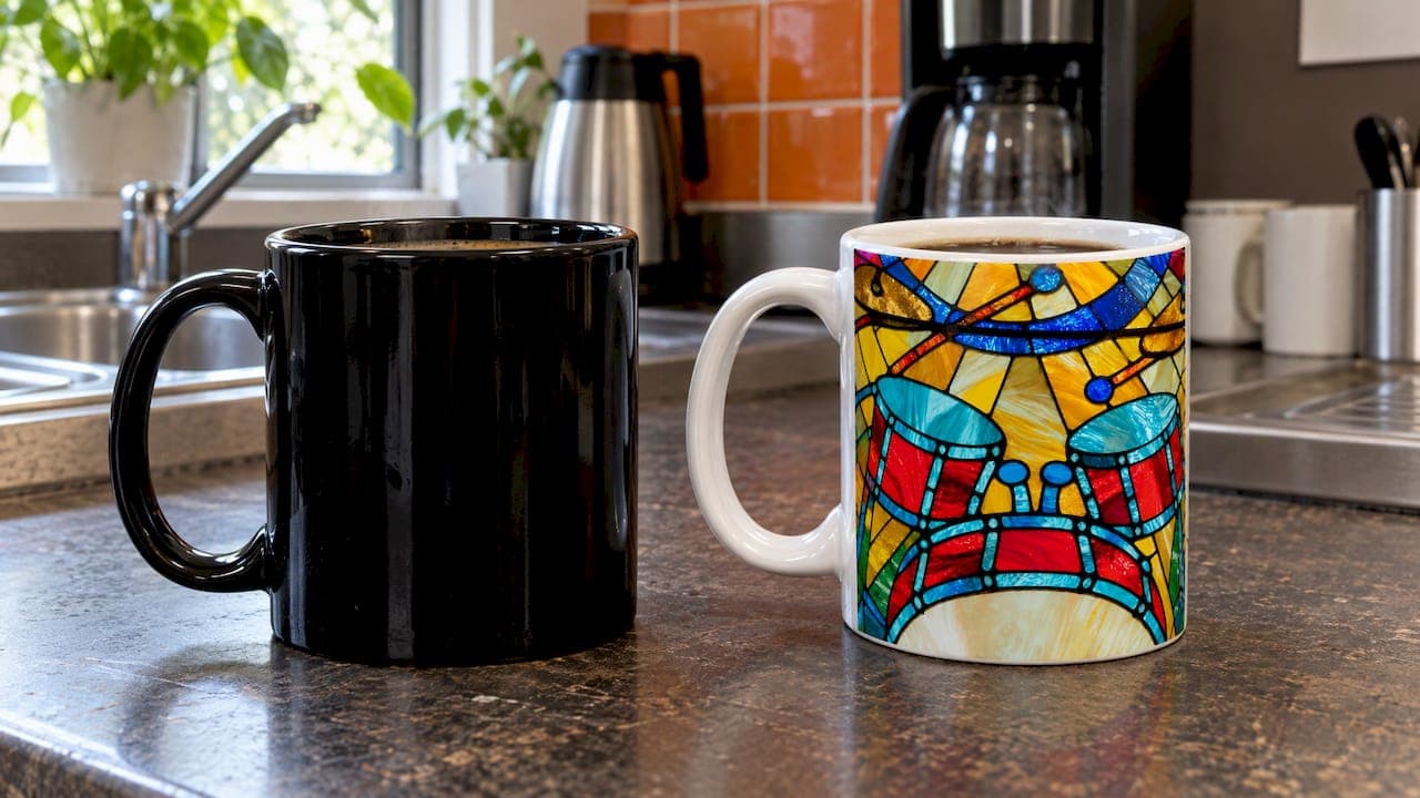
The best mug colour depends on what you want the mug to do. A white or light mug gives artwork the cleanest backdrop and shows off fine linework, a black mug suits bold, high-contrast designs, and a coloured mug adds personality but can change how you judge your drink. Below, we look at the evidence on taste and heat, then at what colour means for printed designs, black-and-white art and photo mugs, with musicians and their gift-givers in mind.
TL;DR
- A 2014 study in the journal Flavour found that mug colour changed how people rated coffee: in a white mug it was rated as more intense and less sweet than in a transparent or blue one.
- Heat is not a reason to pick a side: the difference in cooling between a black and a white mug is tiny.
- For printed designs, strong light-to-dark contrast is what keeps text and linework readable, whichever colour the mug is.
- Bold, simple artwork such as a silhouette, a single instrument or a short quote is the safest match for black mugs. Fine detail has more room on light ones.
- For a musician, choose the colour that fits the design and the person, then personalise it with a name, instrument or in-joke.
Table of Contents
- Does mug colour change how your coffee tastes?
- Does a black mug keep drinks hotter or cooler?
- Black vs white vs coloured: the practical comparison
- Choosing black-and-white design colours for clear contrast
- Black-and-white and monochrome photo mugs
- Which colour suits which musician?
- Material counts as much as colour
- Looking after a printed mug
- Our view on black, white and colour
- Personalise a mug for the musician in your life
- FAQ
- Sources
Does mug colour change how your coffee tastes?
It can, a little. The most cited piece of research is a 2014 peer-reviewed study in Flavour by Van Doorn, Wuillemin and Spence. In the first experiment, the white mug raised the rated intensity of the coffee flavour compared with a transparent mug (p=.026). In the second, coffee served from a white mug was rated as significantly less sweet (p=.041) than coffee from transparent and blue mugs. The authors concluded that mug colour affects ratings of a hot drink and may shape the wider multisensory experience of drinking it.
The likely explanation is visual contrast. Writing in The Conversation, George Van Doorn explained that a drop in perceived sweetness would be expected to raise perceived bitterness or strength, which fits earlier research linking brown with low sweetness. The Sydney Morning Herald reported the same idea in plain terms: coffee looks browner against white, so people read the flavour as stronger or more bitter.
Two things are worth keeping in proportion. The studies were small and compared white with clear and blue mugs, not black. And the effect is about perception, not chemistry: your coffee is the same in any mug. If you notice your drink tastes a touch sharper in a white mug, that is the colour talking, and a mug in a shade you enjoy looking at is a perfectly good fix.

What this means for tea drinkers
Colour also matters for judging strength by eye. The editors at House & Garden, in their discussion of what makes a good mug, say white, bone china or cream tends to flatter tea, while coloured interiors make it harder to gauge how strong the brew is. One editor was relaxed about colour when it came to coffee. So if you like to judge a builder's brew by its shade, a pale interior helps. If you drink black coffee and do not care, any colour works.
A practical compromise is a mug with a light interior and a coloured or black exterior. You get the visual cue inside and the colour outside.
Does a black mug keep drinks hotter or cooler?
Barely. A technical Q&A from the Swedish temperature-sensor company Pentronic explains that colour only affects the heat radiating from the outer surface. A black mug has a slightly higher emissions coefficient than a white one, so in theory it cools a little faster. In most cases, though, the difference in cooling speed is tiny, and it was basically nonexistent in their own experiment.
The things that really decide how long a drink stays hot are the mug's wall thickness, its material, its shape and whether you put a lid on it. If warmth matters to you, look at those first. If you are choosing between black and white, choose on looks.
Black vs white vs coloured: the practical comparison
Here is how the three options compare for everyday use and for printed, personalised mugs. These are general design considerations, not claims about any one product.
| Factor | White or light mug | Black mug | Coloured mug |
|---|---|---|---|
| Backdrop for artwork | Clean, neutral, suits fine linework | Dramatic, suits bold shapes and light-coloured artwork | Sets the mood, limits which ink colours read well |
| Appearance of drink | Coffee looks darker and may seem stronger | Hides the drink's shade, so strength is hard to judge by eye | Depends on the interior colour |
| Best for | Sketches, detailed illustrations, photos | Silhouettes, short quotes, simple icons | Gifts for people with a favourite colour |
| Heat | Practically the same | Practically the same | Practically the same |
| Style | Classic, calm | Modern, striking | Playful, personal |
Choosing black-and-white design colours for clear contrast
A black-and-white mug design lives or dies on contrast. Adobe's colour guide describes black against white as the strongest example of value contrast, and it recommends starting with a greyscale palette to check composition, hierarchy and form before adding any colour. That is excellent advice for a mug, where the design wraps round a curved surface and is often seen at arm's length across a desk.
For text, a handy benchmark comes from accessibility standards. The print-on-demand guide from teelaunch notes that a contrast ratio of at least 4.5:1 for normal text and 3:1 for large text meets WCAG guidance. A mug is not a web page, but the principle carries over: if a line of lyrics or a name would struggle to pass that test on screen, it will struggle on ceramic too.
A few rules we find useful when designing music mugs:
- Design in greyscale first. If the layout works without colour, colour will only help.
- Keep text large and short. A name, an instrument or a one-line joke reads better than a paragraph.
- Give thin lines room. Hairline strokes in a sketch suit a light surface; on a dark one, thicker strokes hold up better.
- Leave a margin around the handle. The handle breaks the wrap, so keep the focal point away from it.
If you want deeper ideas, our guide to black and white mug art styles and techniques covers sketching, line weight and layout, and our music mug design ideas run through six concepts with print-ready specifications.
Why bold beats intricate on a black mug
The teelaunch guide explains how black sublimation mugs work: the print area is white, backfilled with black ink. Because of that, very intricate artwork can suffer from bleeding, and bold, simple designs generally work better. For a musician, that points to designs such as a single treble clef, the outline of a double bass, a drumstick pair or a short line like "I improvise, not mistakes". Save the detailed engraving-style instrument drawings for a lighter mug, where fine lines stay crisp.
Printing method matters as well. Our overview of mug printing methods explains the options and what each one handles well, and the print area size guide gives the canvas dimensions to design to.
Black-and-white and monochrome photo mugs
A black-and-white photo mug is a good way to rescue a photo that is busy, low in light or slightly off in colour. Converting to monochrome removes distracting colour casts and puts the focus on faces, shapes and expression. A concert shot, a student recital or a band rehearsal often looks better in black and white than in colour.
A few habits help any photo reproduce clearly, on a monochrome mug or a full-colour one:
- Start with the sharpest, highest-resolution original you have, not a screenshot or a photo forwarded through a messaging app.
- Pick strong tonal range. A photo with real darks, real lights and clear mid-tones holds up better than one that is flat or grey.
- Keep the subject away from the edges and the handle area, so nobody's face wraps round a curve.
- Choose one clear subject. One person with an instrument beats a crowd.
- Check the preview before you order, looking at both the crop and the contrast.
Our custom mug photo resolution guide covers sizes, placement and the checks to make before you upload. On a black mug, photos are best kept as high-contrast, simple compositions, in line with the bold-over-intricate rule above. For a detailed portrait, a light mug gives the image more room to breathe.
Want to see the range? Our personalised photo mugs for music lovers collection is a good starting point.
Which colour suits which musician?
There is no single right answer, but there are good matches.
The classical player. A white or cream mug with a fine sketch of a violin, cello or piano feels right at home. Pair it with a composer portrait or a line of notation. Our Composer Music history mugs suit this taste.
The rock or metal fan. Black is the obvious home for a bold silhouette, a lightning-bolt motif or a short, punchy slogan. Keep the design simple so it prints boldly.
The music teacher. A light mug with a name, a staff or a funny line about practice is a classic thank-you. Teachers often drink tea at the piano, and a pale interior makes it easy to see how the brew is going, as the House & Garden editors point out.
The student. Coloured mugs in a favourite shade, with a name and instrument, feel personal and fun without being fussy.

The one who has everything. A photo mug in black and white, perhaps from a gig you went to together, makes a gift that feels considered rather than generic.
A quick decision guide
- If your design has fine lines or a detailed illustration, choose a light mug.
- If it is a bold symbol, a short quote or a silhouette, a black mug is a strong option.
- If the recipient judges tea or coffee strength by colour, choose a light interior.
- If you are unsure, go for white: it works with nearly every design and every taste.
Material counts as much as colour
Colour is only one part of the mug. The body material changes weight, feel and how a mug sits in the hand. Our comparisons of ceramic and porcelain mugs and ceramic and bone china mugs help you decide between a sturdy daily mug and a lighter one for gifting. If you are curious about what is trending, take a look at popular unique ceramic mugs.
Looking after a printed mug
Whatever the colour, good care keeps a design looking its best. Avoid abrasive scourers on the printed area, rinse soon after use, and follow the care instructions that come with your mug. Our mug care instructions give practical advice for UK kitchens, such as quick cold soaks for stubborn tea stains. For a broader view on keeping personalised drinkware looking good, these tumbler print care tips cover protecting printed surfaces.
Our view on black, white and colour
We design for musicians, so we start with the question a musician would ask: what do you want this to say?
Our best-loved work is the black-and-white instrument sketch. It looks drawn rather than stamped, and that quiet, thought-out feel is what makes a mug personal. Linework like that loves a light, clean surface, and a name or a favourite joke sits beside it comfortably.
Bold, simple graphics have their own appeal, and contrast is the thing to protect. Whichever colour you pick, we would rather see one clear idea on the mug than five competing ones. A drummer's joke, a cellist's name and a teacher's thank-you all land best when they are easy to read from across the kitchen.
The colour of a mug will not make or break a gift. The thought behind it does, and personalisation is where that thought shows.
Lasse
Personalise a mug for the musician in your life
We make personalised ceramic mugs for musicians, teachers, students and music lovers, with custom instrument illustrations, quotes, names, photos and gift messages. Our personalised music mugs collection brings together instrument, funny, music theory and name designs, and our instrument sketch mugs are the place to begin if you love the hand-drawn look.

Shopping for a gift and short of ideas? Our best personalised music mugs for gifts selection is organised with gift-givers in mind. You can also read how our own reading of the research plays out in our white vs black mugs guide.
FAQ
Does the colour of a mug really change the taste of coffee?
It changes how people rate it. In a 2014 study in Flavour, coffee in a white mug was rated as more intense than in a transparent mug, and as less sweet than in transparent or blue mugs. The coffee itself is unchanged, so the effect comes from what you see.
Is a black mug better for design than a white one?
Neither is better across the board. Black suits bold, simple artwork such as silhouettes and short quotes, while a white mug gives fine sketches and detailed illustrations more room. Pick the colour that matches the style of the design.
Do black mugs keep drinks hotter than white mugs?
Not in any way you would notice. A black mug radiates slightly more heat from its outer surface, but the difference in cooling speed is tiny. Wall thickness, material and a lid make far more difference.
Which mug colour is best for tea?
A white, cream or bone china mug with a light interior is the usual choice, because it lets you judge the strength of the tea by eye. Coloured interiors make that harder.
What makes a good black-and-white photo mug?
A sharp, high-resolution original with clear light and dark areas and one main subject. Keep faces away from the handle and check the preview before you order.
Sources
- Does the colour of the mug influence the taste of the coffee? (Flavour, 2014)
- Bitter coffee today? Try changing the colour of your cup (The Conversation)
- Is the colour of the cup making your coffee bitter? (Sydney Morning Herald)
- What a mug: our editors weigh in on what makes the perfect mug (House & Garden)
- Does coffee stay hotter in a white or black mug? (Pentronic)
- Colour Contrast Guide (Adobe UK)
- Print on Demand Black Mugs: Best Practices (teelaunch)
- Tumbler care: protecting prints and colour coatings