
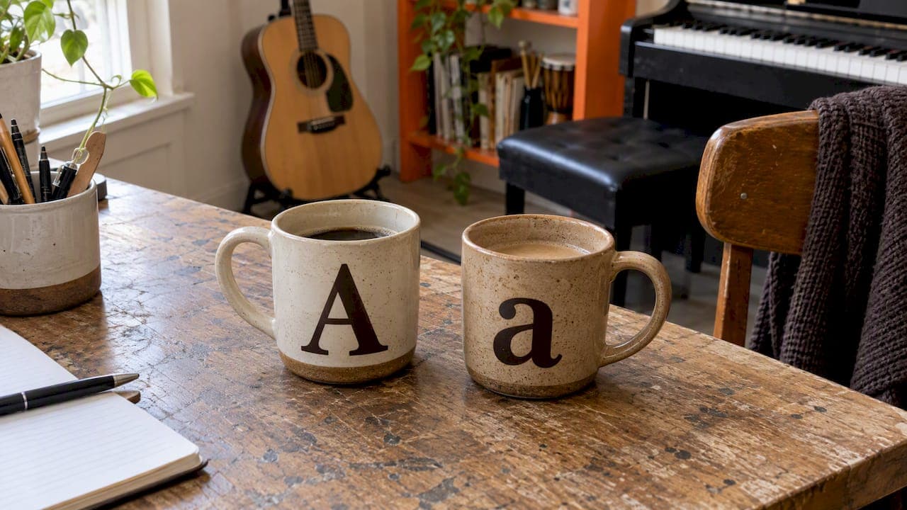
For most personalised mugs, mixed case (a capital first letter followed by lowercase) is the best choice for names and longer phrases, because it reads faster and feels warmer. All capitals work best for a short, bold label such as a single word or an instrument name. Lowercase throughout suits a quiet, modern, slightly wry tone. The right answer depends on the words, the person and where the mug will sit on the desk.
Below, we explain why case changes how a mug feels, how to choose for a musician or music teacher, and what to check before you order.
TL;DR
- Mixed case is the safest option for names and sentences, as it is generally easier to recognise as words than all capitals.
- All caps give a poster-like, confident look. Keep them to one to three words.
- Lowercase only feels relaxed and personal, and it suits dry humour well.
- Match the case to the recipient's personality and the length of the wording, not to a trend.
- Check capacity in millilitres and, if you supply your own artwork, the licence for any font you use.
Table of Contents
- Why case changes the way a mug feels
- What legibility research and road signs tell us
- Uppercase, lowercase and mixed case compared
- How to choose for a musician
- Choosing case for common mug messages
- Our perspective: why we lean towards mixed case
- Practical checks before you order
- Seeing it in a real design
- A quick decision guide
- FAQ
- Sources
Why case changes the way a mug feels
A mug is a small canvas that you see at arm's length, usually while holding it, often before you are properly awake. That is a very different reading situation from a book, and case matters more than most buyers expect.
There are really two jobs the lettering can do. It can be read, meaning someone takes in a name or a joke in a glance. Or it can be seen, meaning it works as a graphic mark, like a band logo. Uppercase tends to serve the second job and mixed case the first.
It helps to be clear that this is a design choice, not a different product. A mug is, in the Cambridge Dictionary's words, a large cup with straight sides used for hot drinks, usually used without a saucer. Whether the letters on it are capitals or small letters changes nothing about the vessel, only about the impression it leaves.
What legibility research and road signs tell us
Typographers have argued about case for a long time, and the useful part of the argument is surprisingly practical.
The best-known British example is the road sign system created by Jock Kinneir and Margaret Calvert, launched on all British roads on 1 January 1965. The Design Museum records that they concluded a combination of upper and lower case would be more legible than conventional capitals. Drivers had a fraction of a second to understand a sign, so legibility was the whole point.
The reason is partly shape. Practical Typography explains that lowercase letters have ascenders and descenders that create a varied contour which helps the brain recognise words, whereas capitals make every word a similar rectangle. The same source notes that long runs of capitals tire the reader.

A mug is not a motorway, and nobody is travelling at 70 mph while reading it. So the lesson is not "never use capitals". It is that case should follow the job the words have to do.
Uppercase, lowercase and mixed case compared
| Style | Feels like | Works best for | Watch out for |
|---|---|---|---|
| ALL CAPS | Bold, confident, poster or stamp-like | One to three words, an instrument name, a band-style label | Long names and sentences become hard to scan |
| Mixed case (Title or sentence case) | Friendly, clear, personal | Names, quotes, dedications, jokes | Can look plain if the font has no character |
| all lowercase | Quiet, modern, understated, a little playful | Short witty lines, first names, a casual tone | Names lose their capital, which some people dislike |
Three short examples show the difference in tone:
- DRUMMER in capitals reads like a title on a gig poster. It is declarative.
- Drummer in mixed case reads like a name tag. It is friendly.
- drummer in lowercase reads like a muttered aside. It is gentle.
The same single word, three personalities. That is why it is worth thinking about before you order rather than accepting whatever the default looks like.
How to choose for a musician
Musicians are particular about notation, spelling and detail, so it pays to be deliberate. Work through these questions in order.
- How long is the wording? Under about three words, any case works. Over that, move to mixed case.
- Is it a person's name? Names are normally written with a capital initial. If you drop the capital on purpose, make sure the recipient would enjoy that. Some people find a lowercase name charming, others find it careless.
- Is it a joke? Dry, understated humour often lands better in lowercase or sentence case. A line such as "I improvise, not mistakes" reads like a wink in mixed case and like a shout in capitals.
- Does the design include an illustration? A detailed instrument sketch already carries visual weight. Pair it with quiet lettering so the two do not compete.
- Who is it for? A teacher's mug used in a busy studio may benefit from a clear, readable name. A drummer's mug might welcome bold capitals.
Matching case to instrument and personality
There is no rule that a violinist needs lowercase and a rock guitarist needs capitals, and we would be wary of anyone who claimed otherwise. What does hold is the broader principle from the Design Museum's account of road signage: typography is functional as well as decorative, so the most successful lettering fits the message and the person. A reflective cellist who loves understated humour may prefer something soft. A brass section player who treats every rehearsal as a gig may love capitals.
If you cannot decide, mixed case is the choice you are least likely to regret.
Choosing case for common mug messages
Names and initials
Mixed case is the default for good reason: it is how the name is written everywhere else. For a short first name, capitals can look striking, especially above an instrument illustration. For double-barrelled or long names, capitals quickly take up width and push the font size down.
If you are stuck for naming ideas, our guide to musician mug names has examples you can adapt.
Quotes and jokes
A line of ten words or more should almost always be in mixed or sentence case. Setting a full sentence in capitals makes it harder to read and can come across as shouting, which is rarely the effect you want with gentle humour. For ideas on wording that reads well on ceramic, see our piece on how to craft personalised musical mug messages.
Dedications and thank-you notes
A thank-you from a student to a teacher is personal, so it should look personal. Mixed case, with the name in a slightly more prominent size, usually feels sincere without being heavy. Capitals can read as formal or even stern in this setting.
Single-word labels
This is where capitals shine. "VIOLA", "BASS", "ENCORE" or "TUTTI" have a compact, confident shape. They also work well in a repeated pattern if you want a theme-based design. Our music theory and pattern mugs are a good place to see how short words and graphics sit together.
Our perspective: why we lean towards mixed case
We design for musicians, music teachers and the people who buy gifts for them, and we see the same pattern repeatedly: the mug that feels most personal is usually the one where the words are easy to take in. A name that is instantly readable feels like it was made for someone. A name that has to be deciphered feels like a label.

Our designs lean on simplicity, hand-sketched instrument drawings and a lightly self-aware sense of humour. In that setting, lettering should support the illustration and the joke instead of competing with them. Mixed case does that most reliably. We still enjoy capitals for a single punchy word, and a lowercase line can be lovely when the humour is dry.
Our advice to gift buyers is simple. Say the message out loud in the recipient's voice. If it sounds like a shout, use capitals. If it sounds like a conversation, use mixed case. If it sounds like a smile behind a hand, try lowercase.
— Lasse
Practical checks before you order
Size and capacity
Case affects how much room the words need, and capitals are wider. Know the print area before you plan the wording. Suppliers commonly describe a standard personalised mug as 330 ml, often called 11oz, about 95 mm tall and 83 mm across. Shape matters too: one guide points out that mugs can be cylindrical, tapered, tall, squat or oversized, and each changes how much of the design is visible at once.
The handle also splits the wraparound, so a long line in capitals may be hidden from one angle. Keep key words away from the handle side.
Cups, mugs and ounces
If you are comparing products, note that a cup is generally smaller and often used with a saucer, while a mug is larger and used without one. For measurements, UK buyers should look at millilitres first. One UK council recipe conversion sheet lists 1 cup as 240 ml or 8 fl oz, and half a cup as 120 ml or 4 fl oz. That answers the common "is a cup 4 or 8 oz?" question, but a mug is a different, larger size, so treat ounces on a product listing as a secondary label.
Fonts and licences
If you are supplying your own artwork for a commercial product, check the font licence. UK law treats ordinary use of a typeface in typing, composing text or printing separately from making or dealing in articles designed to produce a typeface. That does not mean every downloaded font is cleared for commercial use, so keep the licence for any font you rely on. If you only want a mug for personal use or as a gift, ordering a design from a specialist shop avoids the question entirely. For anything with legal consequences for your own business, speak to a solicitor or the font's publisher.
Proof your text
Whatever the case, read the wording slowly, twice, and ask someone else to read it. Look at apostrophes, spellings of names and any musical terms. Capitals can hide small errors, and lowercase can turn a proper name into something unintended.
Seeing it in a real design
The best way to settle uppercase against lowercase is to look at a few finished mugs. We would suggest browsing our personalised music mugs, which include instrument designs, funny music mugs and personalised name mugs. Our instrument sketch mugs are a good example of quiet lettering paired with a detailed drawing, while the composer and music history mugs show how a name can carry a design on its own.
If you are buying for someone else, our best personalised music mugs for gifts collection is a good starting point, and the article on examples of personalised mugs for music lovers shows how different ideas look in practice. When you are ready to start from scratch, our guide to custom mug design walks through the process.
A quick decision guide
Use this when you are short of time.
- Name of a teacher or friend: mixed case.
- Instrument name alone: capitals, or mixed case if you want it friendlier.
- Funny sentence: sentence case, or lowercase if the joke is dry.
- Long dedication: mixed case, always.
- Band-style or pattern design: capitals, kept short.
- Unsure: mixed case.
The point is not to follow a rule for its own sake. It is to make sure that when the mug is lifted on a Monday morning, the person holding it smiles at the words rather than squinting at them.
FAQ
Are capital letters or lowercase letters better on a personalised mug?
Neither is better in every case. Mixed case is generally easier to read, so it suits names and sentences. Capitals suit a short, bold label, and lowercase suits a quiet or witty tone.
Is all caps lettering hard to read on a mug?
It can be if the wording is long. Typography sources note that capitals are harder to read than ordinary lowercase text at body-text sizes, because every word takes a similar rectangular shape. On a mug, keep capitals to a few words and the problem largely disappears.
What is the difference between a cup and a mug?
A cup is generally smaller and often comes with a saucer, while a mug is larger, has straight sides and is normally used without a saucer. Personalised drinkware in the UK is most often a mug, which is why lettering has a decent amount of room to work with.
Is one cup 4 or 8 oz?
It depends on the measuring system. A UK recipe conversion sheet lists 1 cup as 240 ml or 8 fl oz, with 4 fl oz as half a cup. A standard personalised mug is usually described in millilitres, so compare those figures rather than ounces.
Sources
- Jock Kinneir and Margaret Calvert, Design Museum
- British Road Signs, Design Museum
- Mug definition, Cambridge English Dictionary
- All caps, Practical Typography
- Copyright, Designs and Patents Act 1988, typefaces
- 101 Square Meals, recipe conversions
- Standard personalised mug size and dimensions
- How to choose the right mug size and shape