
Finding a mug that feels genuinely personal rather than generic is harder than it sounds. Most mass-produced options either drown the recipient in cluttered artwork or offer something so vague it could belong to anyone. For musicians and music lovers, the ideal mug sits in a more considered space, one where a clean design, a well-chosen joke, or a single elegant instrument illustration says everything without shouting. This guide walks through the principles, decisions, and practical steps that turn a blank ceramic canvas into a small, meaningful gift that earns a smile every morning.
Table of Contents
- Foundations of minimalist mug design for musicians
- Choosing your message and graphic: Keep humour and meaning clear
- Design layout and readability: Making every detail count
- Mockups, testing, and common mistakes to avoid
- Why less is more, but not boring: Our take on minimalist musician mugs
- Find or create your ideal minimal music mug
- Frequently asked questions
Key Takeaways
| Point | Details |
|---|---|
| Clarity comes first | Limit text, use bold fonts, and design with instant readability in mind. |
| Keep it personal | A single joke, name, or icon makes your mug memorable and unique. |
| Test before final print | Mockup your design and check for wraparound or handle interference issues. |
| Favourite simple ideas | Playful minimalism with a music twist consistently resonates as a gift. |
Foundations of minimalist mug design for musicians
Now that you understand the value of a well-designed gift, let's break down what makes a musician's mug minimalist yet meaningful.
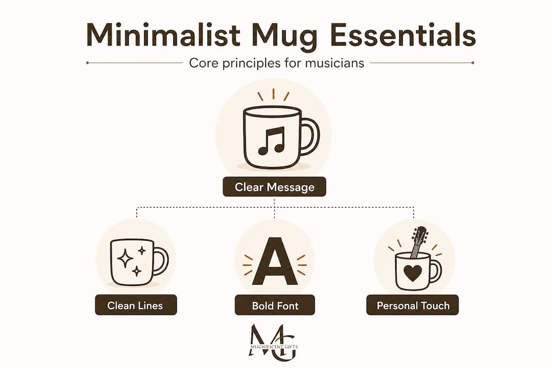
Minimalism in mug design is not about removing all character. It is about being deliberate. Minimalist mug design principles include clean lines, neutral colour palettes, and functional elements that work together to achieve a confident, uncluttered result. When applied to musician themes, this philosophy allows a single bold treble clef or a dry musical pun to carry the full weight of the design without competing with background noise.
The phrase "less is more" is not simply a design cliché. It reflects a genuine truth about how the eye processes visual information. On a curved mug surface, a restrained layout allows humour and iconography to land cleanly, giving the viewer space to appreciate the joke or the image rather than decoding it. Think of it like a well-timed musical rest: the silence makes the note that follows more powerful.
Balancing form and function is equally important. Ergonomic handles, honest materials, and visual proportion all contribute to a mug that feels as good to hold as it looks on a shelf. A design that wraps awkwardly around the handle or crowds the rim will undermine even the cleverest concept.
Core minimalist principles at a glance
| Principle | Why it matters | Musician mug application |
|---|---|---|
| Clean lines | Reduces visual noise | Simple instrument outlines |
| Neutral colour palette | Lets key elements stand out | Black on white, grey on cream |
| Functional balance | Comfortable to hold and use | Design placed away from handle |
| Visual proportion | Creates harmony on a curved form | Single graphic, short text |
| White space | Gives the eye room to rest | Margins around all elements |
Applying these principles does not mean a mug needs to look austere. Quite the opposite. Expressing individuality in a minimalist style is entirely possible when the choices are made with intention. A small sketch of a double bass paired with the owner's name in a clean serif font is both minimal and deeply personal. You can also browse popular unique ceramic mugs to see how this balance is already being achieved with real musician audiences in mind.
Key considerations when starting any minimalist music mug concept:
- Commit to one dominant visual element, either text or graphic, not both competing equally
- Choose a background colour that provides natural contrast without saturation
- Leave at least 20 percent of the visible surface as breathing space
- Ensure any illustration is recognisable at thumbnail scale, which mirrors how it reads at a glance on a busy kitchen counter
- Align your design to the visual centre of the mug's largest visible panel
Choosing your message and graphic: Keep humour and meaning clear
With core principles established, next is crafting your mug's identity with the right phrase and image.
The single most common mistake in custom mug design is trying to say too many things at once. A great musician mug commits to one idea. It might be a pun, a catchphrase, or a simple iconic image. Humorous designs for music enthusiasts often use wordplay such as "Guitar Wanker" or "BACH! Humbug!!" with bold text and minimal cartoon elements, and they work precisely because the joke arrives instantly. There is no decoding required.
When choosing your message, consider these four steps:
- Define the one idea. Is it a pun, an inside joke from a band, a reference to a specific instrument, or a personality trait like "perpetually flat"? Write it down in a single sentence before touching any design tools.
- Test the text limit. No more than two lines of text. Every additional word dilutes impact. If the joke needs three lines to land, rewrite the joke.
- Select the right font. Bold, readable fonts with high contrast suit musician mugs best. Avoid ornate scripts that look beautiful at large sizes but blur on a ceramic surface. Sans-serif typefaces such as Futura, Gill Sans, or similar designs hold up exceptionally well.
- Test for universal recognition. Show your concept to someone unfamiliar with the specific reference. If they need a lengthy explanation, the design needs simplifying. A great mug joke should spark a smile within three seconds.
Comparing message types for musician mugs
| Message type | Example | Strength | Risk |
|---|---|---|---|
| Instrument pun | "I'm on the right track (every time)" | Instant laughs, broad appeal | May feel generic |
| Personalised name | "Sophie's Cello Fuel" | Deeply personal | Limited to one recipient |
| Genre reference | "Classical gas required" | Niche appeal | Misread by outsiders |
| Attitude statement | "I improvise, not mistakes" | Clever, versatile | Needs strong font choice |
| Minimalist icon | Single violin silhouette | Elegant, timeless | Less humorous |
Design tips emphasise quick readability and gift context for higher conversion in musician-targeted products. This confirms what experienced designers already know: the first impression is everything, and that impression happens in a glance.
Pro Tip: Before finalising any text, hold your phone at arm's length and look at your design mockup from that distance. If the words blur or the joke is unclear, the font is too thin or too small. Legibility at a distance mirrors legibility at the breakfast table.
For further inspiration on musical wordplay, explore music-themed mug designs and browse personalised music mug ideas to see how humour and identity are combined in real products. When looking for a ready-made gift, top gift music mugs offer a curated starting point worth exploring.
Design layout and readability: Making every detail count
Once you have your message, the next step is arranging it for practical, stylish impact.
Layout is where many otherwise strong concepts fall apart. A well-chosen joke placed too close to the handle becomes invisible during use. A graphic that sits too high near the rim gets obscured by the contents. The architecture of a mug design matters as much as its concept.
Follow these steps to arrange your elements for maximum clarity:
- Establish a visual hierarchy. Place the primary message, whether graphic or text, at the optical centre of the mug's main visible panel. Supporting elements, such as a name or small secondary graphic, sit below or to the side, never competing for dominance.
- Position away from the handle. The area directly adjacent to the handle is frequently hidden during normal holding. Keep all critical design elements within the central third of the mug's circumference.
- Use kerning and spacing intentionally. Tight lettering can make playful text feel severe. Open spacing between letters in short puns often adds warmth and readability simultaneously.
- Prefer a side panel approach for short text. Using hierarchy with one primary message, with proper kerning and spacing, and preferring a side panel over full-wrap for short text, avoids handle obstruction and keeps the design clean.
- Test at distance. Place the mockup on a surface and step back two metres. Every element should read clearly without squinting.
"A mug design that works from two metres away will always work from two centimetres. The reverse is rarely true."
Prioritising readability in custom mug designs means using simple concepts that are clear from thumbnails, avoiding crowded artwork that loses its meaning at small scales.
Pro Tip: Use a grid overlay in your design software to ensure all elements align to a consistent visual axis. Even subtle misalignment disrupts the perception of quality, particularly on minimal designs where every element carries more visual weight.
For ideas on how layout choices affect the overall gift experience, read about choosing memorable mug layouts. If you are considering a photograph or detailed illustration, photo mugs for musicians show how imagery can integrate cleanly into a minimalist framework. You might also find inspiration in minimalist layout techniques drawn from adjacent creative fields, where similar principles of restraint and intention govern every decision.
Mockups, testing, and common mistakes to avoid
To ensure your mug delivers the right impression, double-check the finished design before gifting or selling.
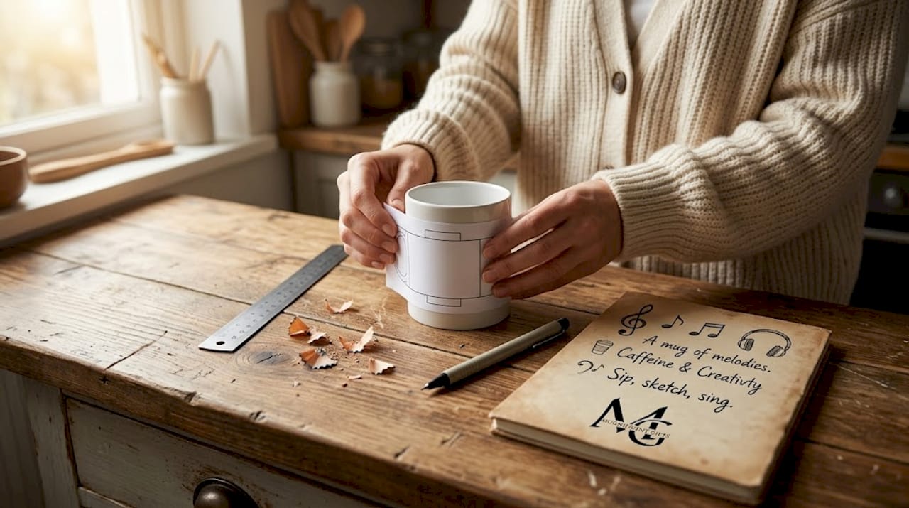
The gap between a concept you love on screen and a printed mug you hold in your hands can be significant. Testing before committing is not overcaution. It is the single most effective way to protect your creative investment and ensure the recipient's experience matches your intention.
Work through these steps before finalising any print order:
- Create a digital mockup first. Most design platforms and print-on-demand services offer three-dimensional mug mockup tools. Use them. Seeing the design on a curved surface often reveals spacing and proportion issues invisible on a flat canvas.
- Check wraparound text carefully. Full-wrap designs are particularly vulnerable to text that warps, tilts, or disappears around the handle join. If any critical word falls in that zone, reposition it.
- Assess from the typical holding angle. Most people hold a mug with the handle to the right, viewing the left-centre panel. Position your primary message precisely in that zone.
- Iterate with small tweaks. Adjust font size by two points. Shift a graphic five millimetres. These micro-adjustments often produce a dramatic improvement in overall visual harmony.
"The best mug designs look effortless. That effortlessness is usually the result of several rounds of careful refinement."
Critically, avoid overcomplicating with too much text, limiting copy to one or two lines, and test mockups early for wraparound issues. This advice applies whether you are designing a single personalised gift or a small batch for a band's merchandise table.
Pro Tip: Print a paper template at the actual mug dimensions and wrap it around a similar-sized cylindrical object, such as a tin or a glass. This low-tech test reveals wraparound distortions before you spend anything on a physical print.
Understanding the personality behind a mug can also guide your testing instincts. The guide to understanding mug personalities offers a useful framework for thinking about how different musicians relate to design. For tactile inspiration on how creative objects can be displayed and presented, display ideas for collectibles offers a useful parallel from another collector-focused creative world.
Why less is more, but not boring: Our take on minimalist musician mugs
Having mastered the process, let's step back for a candid perspective on what truly resonates with musicians when it comes to mug design.
There is a version of minimalism that is cold, corporate, and forgettable. A white mug with a single grey line across it might technically qualify as minimal, but it earns nothing. It starts no conversations. It makes no one laugh at 7am. That is not what we are talking about here.
The minimalism that works for musicians is playful restraint. It is the art of knowing exactly which one thing to say and trusting the recipient to get it. Pure minimalism without personality risks feeling sterile, which is precisely why subtle personalisation or humour adds engagement without clutter. Simple designs consistently outperform complex ones in sales and in daily appreciation, not because simplicity is lazy, but because it respects the viewer's intelligence.
Musicians, in particular, respond to designs that feel like they were made specifically for them. A violinist does not need a mug that lists every orchestral instrument. They need one that makes a joke only a violinist would fully appreciate. That insider quality, that whispered recognition of "you belong here," is what transforms a functional object into something treasured. You can see this principle in action across popular humorous mug examples that balance wit with warmth.
The sweet spot is this: if your mug's message is clear from across the room, and the design feels personal rather than printed-en-masse, you have achieved something genuinely special. That combination is rarer than it should be, and when it arrives, it earns a place on the best shelf in the kitchen.
Find or create your ideal minimal music mug
Ready for more ideas or to buy? Here is where to find or customise the perfect mug for yourself or a music-loving friend.
Whether you have a concept fully formed or you are still searching for the right combination of wit and warmth, Mugnificent Deals offers a creative starting point that feels considered rather than mass-produced.
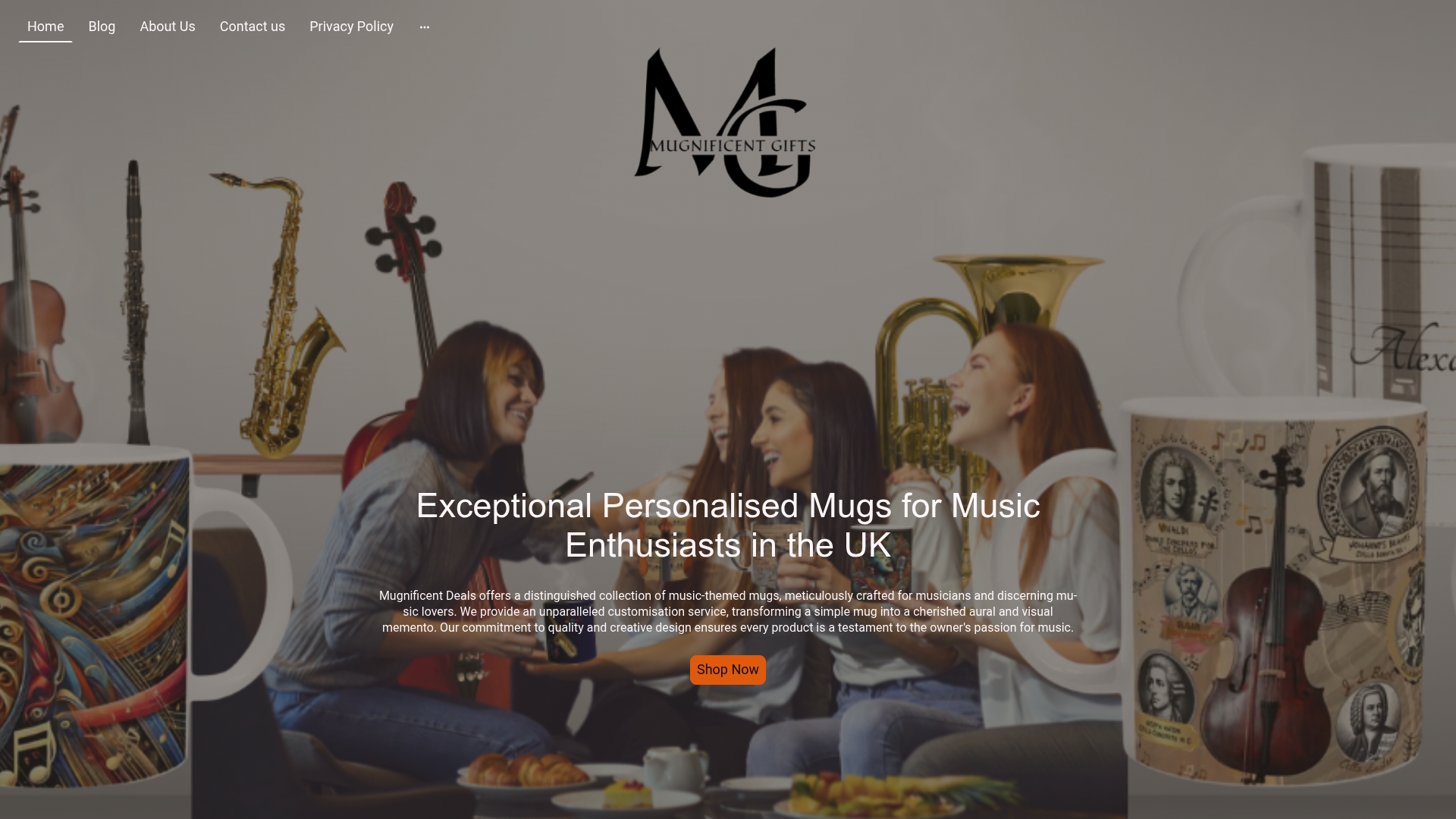
Browse the full range of personalised music mugs to explore how instrument themes, musical puns, and clean design work together in practice. If you are searching specifically for a gift that will feel both personal and polished, the collection of best gift mugs brings together the most loved designs in one place. For a broader look at what resonates with real buyers, unique popular mugs showcases the designs that consistently earn smiles and repeat purchases. Every option is designed to feel as though it was made for one person, because the best gifts always do.
Frequently asked questions
What is the best size and shape for a minimalist music mug?
A standard 11 to 12oz mug with a comfortable handle is ideal, large enough to display the design clearly but proportioned for easy daily use.
How can I add a personal touch without making the mug look busy?
Use a single musical icon, a well-chosen pun, or a name in a bold clear font, and keep text to one or two lines to maintain simplicity without losing personality.
Are minimalist mugs still engaging as gifts for musicians?
Yes, witty or personalised minimalist designs consistently feel special because they show thought and care. Design tips confirm that quick readability and a strong gift context make musician-targeted mugs particularly well received.
What fonts and colours work best for readable musician mugs?
Bold sans-serif fonts on high-contrast neutral backgrounds work best. Minimalist mug design principles favour clean lines and neutral colour palettes precisely because they ensure legibility and a timeless, modern appearance.