
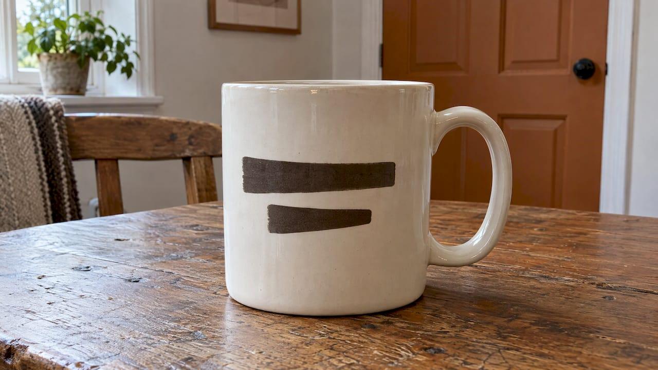
The best line breaks on a mug follow the way the message sounds when read aloud: split at a natural pause, keep each line short, and give the longer line to the bottom. A mug is curved, so you only ever see part of the wording at once, and every break has to earn its place. This guide explains where to break a joke, a name or a music quote, and how to keep a personalised design looking calm rather than crowded.
TL;DR
- Break lines where you would pause when speaking, never in the middle of a phrase such as "to" plus a verb.
- On two lines, make the bottom line the longer one. On three, try short, long, short.
- Keep the whole message inside the part of the mug someone can see at once, and clear of the handle zone.
- Give each line a job: the name or punchline first, optional wording last, and cut it before you shrink the type.
- Use bold, sturdy lettering. Thin scripts and small secondary lines are the first to fade on a curved surface.
Table of Contents
- Why line breaks matter more on a mug than on paper
- Break where you would pause
- The shape of the lines: two lines, three lines
- Worked examples for music mugs
- Give every line a job
- Fonts, size and the curve
- Think about both sides of the handle
- Names, instruments and inside jokes without the clutter
- Our view: let the words breathe
- Find a mug that fits your message
- A quick checklist before you order
- FAQ
- Sources
Why line breaks matter more on a mug than on paper
On a poster, the reader's eye takes in the whole layout in one glance. A mug works differently. The ceramic curves away from the viewer, the handle interrupts the wrap, and the drinker holds it at an angle. Brilliantor's guide to typography on small merchandise makes the point that a curved mug shows only part of the message from a normal viewing angle, so the designer has to decide which part is visible instead of borrowing layout rules from flat products.
That is why a line break on a mug is not a cosmetic detail. A sentence that stretches around the wrap is read one fragment at a time, and the joke can arrive in the wrong order. A well-placed break keeps the thought together on the face of the mug that people actually see.
For musicians, music teachers and the people buying gifts for them, the stakes are small but real. A mug with the wording "I improvise, not mistakes" only lands if the reader meets it in the right rhythm. Break it badly and the punchline loses its timing.
Break where you would pause
The simplest test needs no software. Read the text aloud and pause firmly at every break. If the pause sounds natural, the break works. If it sounds like a stumble, move it. A Graphic Design Stack Exchange answer on line breaks suggests exactly this read-aloud approach and adds three language-based rules:
- Do not split an infinitive. Keep "to" and its verb together: "to play" stays on one line.
- Do not separate an adjective from the noun it describes. "Perfect" and "pitch" belong on the same line.
- Do not strand the last word before a comma at the end of a line. Let the comma sit with its phrase.
To these we would add a musician's version of the same idea: treat a phrase like a musical phrase. You would not breathe in the middle of a bar, and you should not break in the middle of a thought.
Keep small words with what they introduce
Articles, prepositions and conjunctions ("the", "of", "and") look odd when left at the end of a line. "Drummers keep the" followed by "beat" reads as unfinished. Moving "the" down to join "beat" fixes it at once.
Let the punchline stand alone
With humour, the final line should usually hold the turn of the joke. Set the setup on the first line or lines, and put the payoff by itself so it arrives last. If the whole joke is only a few words, a single break just before the punchline is often all it needs.
The shape of the lines: two lines, three lines
Once the breaks follow the meaning, look at the overall shape. The same Stack Exchange answer recommends that with two lines, the bottom line should be longer than the top, which gives a feeling of upward movement and a solid base. For three lines, a short, long, short pattern gives balance.
This is a guideline, not a law. When meaning and shape disagree, meaning wins. But when you have a choice between two natural breaks, choose the one that gives the better silhouette.
| Shape | When it works | Example |
|---|---|---|
| Two lines, short over long | Setup and payoff of a short joke | "Keep calm and" / "practise your scales" |
| Three lines, short, long, short | A name, a phrase and a tag line | "Sarah's" / "cello practice fuel" / "since 2019" |
| Single line | A name or one strong word | "Maestro" |
| Stacked words | A rhythmic list | "Eat" / "Sleep" / "Rehearse" |
Worked examples for music mugs
Here are four common situations, with the break that reads best and the reason.
A joke for a jazz player. "I improvise, not mistakes" can break as "I improvise," on the first line and "not mistakes" on the second. The comma ends the first line, so the pause is natural, and the second line, being longer, forms the base. The punchline comes last.
A gift for a piano teacher. "World's Best Piano Teacher" is tempting to split as "World's Best" and "Piano Teacher". That works: the adjective stays with its noun, and the bottom line is longer. Splitting after "Piano" would separate it from "Teacher" and read awkwardly.
A name plus an instrument. For "Emma's Violin Coffee", three lines look tidy: "Emma's" / "Violin" / "Coffee". If the name is long, give it a line to itself rather than squeezing it next to other words. Our guide to where to put a name on a mug covers placement in more detail.
A music quote. Quotes are longest, and the temptation is to include everything. Break at the natural clauses, and put the attribution on its own small line only if it stays legible. If the quote needs more than three lines, shorten it. A shorter quote on a bold line beats a complete one in tiny type.

Give every line a job
Brilliantor's guidance is to give each line a job: sort the wording into essential, useful and optional, and remove optional wording before you compress lines into a smaller block. It also warns against assuming that a long line across a wrap can be read all at once.
Apply that to a mug and the process is straightforward:
- Essential: the name, the instrument, or the punchline. This gets the biggest, boldest line.
- Useful: the setup, a year, a short descriptor. This sits in a clearly smaller but still readable line.
- Optional: a second joke, a date, a sign-off. Cut it first if the design feels tight.
The temptation with personalised gifts is to add "just one more thing", such as a name, a joke and a dedication. Each extra line costs space and makes the others smaller. A calm design usually has one clear focal point.
Fonts, size and the curve
Line breaks and type choices work together. A well-broken message in a thin, fussy font can still disappear on a curved surface.
Prime Journal's UK guide to mug wraps advises keeping the main message to one strong line, treating secondary text as optional, using thicker weights for primary text and keeping key content away from the far left and right edges of the wrap. It also notes that thin scripts and delicate serifs often lose clarity on curved surfaces, and that small secondary lines tend to vanish first in real use. A useful shortcut from the same guide: view your design as a zoomed-out thumbnail. If you can still read it, it will probably read at arm's length.
Google Fonts' typesetting guide explains the physics. On a curve, larger sizes and greater curvature exaggerate perceived distortion, and all-caps or serif typefaces can mask uneven spacing between characters. It also notes that the rotation of each glyph is more noticeable with wider characters, while the spacing between glyphs is more noticeable with narrower ones, so size and spacing should be adjusted together.
In practice, that gives you a short checklist:
- Choose a heavy, confident typeface for the main line.
- Keep line lengths modest, so each one sits comfortably in the visible area.
- Leave generous margins on both sides of the design.
- Avoid tiny text for anything the recipient needs to read.
If you want to know how many characters fit on a line, our guide to mug character limits for names and lines goes through it. And if you are choosing between mug sizes, the 11oz versus 15oz print area guide shows how much room each one gives your lines.
Think about both sides of the handle
A mug has two faces, and which one the drinker sees depends on the hand that holds it. That means a setup on one side and a punchline on the other may never be read in order. If you split a joke across both sides, each side must make sense by itself.

A safer approach for most gifts is to keep the full message on one face and use the other for a simple repeat, a small motif or nothing at all. For musicians, an instrument sketch on one side and a short line on the other works well, because each stands alone. Our article on music mug design ideas has more layouts to borrow from.
Names, instruments and inside jokes without the clutter
Personalised mugs often combine three things: a name, an instrument and a joke. They compete for space, so decide which one matters most to the person receiving it.
- For a student's gift to a teacher: the teacher's name and instrument are the stars. Keep the joke short or leave it out.
- For a bandmate: the inside joke is the point, so let it take the largest line and keep the name small.
- For yourself: the instrument and a favourite phrase usually do the job, with no name needed.
Because you will probably see a mug design on a screen before you see it in your hands, check it at a glance. If you cannot tell within a second what the main message is, simplify.
Our view: let the words breathe
We design music mugs for people who think in phrases, so we think about line breaks the way a musician thinks about rests. The silence between lines is part of the message.
Our mugs are built around personalisation: names, instruments, quotes, photos and gift messages. That variety is the joy of them, and it is also where designs go wrong. Too much wording squeezed into too small a block loses the charm that made the gift worth giving.
Our advice is to choose one thing the mug should say, give it the boldest line, and let everything else support it. A name, a short joke and a drawing of the right instrument are plenty. When a message feels too long for the space, we would rather shorten the message than shrink the type.
That focus on the gift, rather than on cramming in text, is what we mean when we say our mugs are thoughtful rather than generic.
Lasse
Find a mug that fits your message
If you would like a design that already thinks about layout, our personalised music mugs cover instrument designs, funny music mugs, music theory and pattern mugs and personalised name mugs. Our personalised mugs feature custom instrument illustrations, music quotes, names, photos and gift messages, designed for musicians, music teachers, students and music lovers.

For a gift with a bit of storytelling, browse the instrument personalised sketch mugs or the composer and music history mugs. If you need ideas for what to put on the mug, our best personalised music mugs for gifts collection is a good place to begin.
A quick checklist before you order
- Read the message aloud and mark every pause.
- Check that no infinitive, adjective-noun pair or comma-ending word is split.
- Make the bottom line longer if you have two lines.
- Keep to three lines at most, and cut optional wording first.
- Choose a bold typeface and keep margins clear of the edges and handle zone.
- Shrink the preview to thumbnail size and confirm the main message still reads.
- If you are weighing text against a picture, our guide to text versus photo mugs can help you decide.
FAQ
How many lines of text should a mug have?
One to three lines suit most mugs. A single bold line works for a name or a single word, and two or three lines carry a joke or a short phrase. Beyond three, each line has to shrink, and the message becomes harder to read at arm's length.
Should the longer line go on top or at the bottom?
For two lines, put the longer one at the bottom. This is a typographic guideline that creates a stable base and a sense of upward movement. For three lines, a short, long, short pattern usually looks balanced.
What should I write on a mug for a musician?
Choose something short that speaks to their instrument or their sense of humour: a name with an instrument, a pun about practice, or a line like "I improvise, not mistakes". Short wording gives you room for larger, clearer lettering and better line breaks.
Can I split a joke across both sides of the mug?
You can, but each side must make sense alone, because which side is seen depends on how the mug is held. A single-face message with a simple motif on the other side is the safer route for gifts.
Sources
- How do you decide line break and length of sentence in a creative or ad design? (Graphic Design Stack Exchange)
- Typography on Small Merchandise: Make the Message Readable (Brilliantor)
- The Mug Wrap Reality Check (Prime Journal)
- Typesetting on a curved path (Google Fonts Knowledge)