Most people assume minimalist mug design simply means fewer colours or a cleaner look. That assumption misses the point entirely. To explain minimalist mug design properly, you need to understand it as a deliberate decision framework, not an accidental sparseness. Every line, every gap, every typographic choice on a minimalist mug has been weighed and kept only because it earns its place. This guide unpacks the philosophy, the production realities, and the creative discipline behind this widely admired yet frequently misunderstood aesthetic approach, giving you the foundation to both appreciate and apply it with genuine confidence.
Table of Contents
- Key takeaways
- The core principles of minimalist mug design
- Simplicity versus emptiness: the philosophical split
- Practical challenges of designing on a 3D cylinder
- Popular minimalist mug styles and features
- Applying minimalist principles in your own designs
- My honest take on minimalism in mug design
- Find your sound in simple form
- FAQ
Key takeaways
| Point | Details |
|---|---|
| Minimalism is a framework | Every design element must earn its place through clear function, not decoration. |
| Negative space is intentional | Empty areas are active design tools that control attention and create visual breathing room. |
| East meets West in philosophy | Western simplicity reduces for clarity; Japanese emptiness invites personal interpretation and meaning. |
| Production shapes aesthetics | Handle zones, curvature, and print tolerances must inform every minimalist layout decision. |
| Restraint makes gifts meaningful | Simpler designs age better, appeal more broadly, and hold emotional resonance across contexts. |
The core principles of minimalist mug design
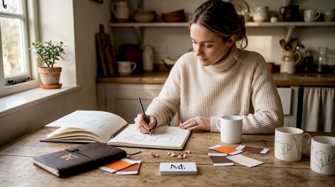
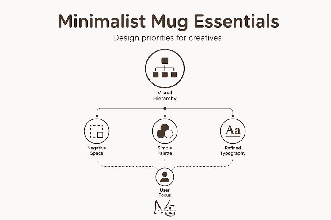
The phrase "minimalist design" gets used loosely, but the discipline behind it is precise. At its core, minimalism as a decision framework requires every visible element to serve a clear, non-overlapping role. Nothing competes. Nothing repeats what another element already says. This principle becomes especially demanding on a mug, where the canvas is small, curved, and viewed from multiple angles simultaneously.
Visual hierarchy is the organising principle that makes this work. On a flat poster, hierarchy is straightforward. On a cylindrical mug, you are designing for a surface that rotates away from the viewer. The most important element must sit confidently in the dominant viewing zone, usually the face of the mug opposite the handle, with supporting elements arranged so they feel balanced from every angle without crowding.
Negative space is the concept most often misread. White space, or empty ceramic surface, is not leftover area. Negative space directs attention and creates the visual breathing room that makes a design feel calm rather than cluttered. Think of it as the silence between musical notes. Without it, even a beautiful phrase becomes noise.
Pro Tip: Sketch your mug design on a flat rectangle first, then physically wrap that sketch around a cylindrical object. You will immediately see how spacing shifts and where your hierarchy breaks down.
Minimalist mug styles in their strongest form rely on controlled colour palettes, typically one or two tones, and simplified geometric or typographic compositions. The restraint is not poverty of imagination. It is disciplined editing, the kind that takes more creative effort than decoration ever does.
Simplicity versus emptiness: the philosophical split
This is where understanding mug design gets genuinely interesting. Western minimalism and the Japanese concept of ma (emptiness) look similar on the surface but operate from fundamentally different intentions.
Western minimalism reduces. It strips away elements to clarify function or reveal form. A mug designed under this philosophy might carry a single bold geometric mark because everything else has been judged unnecessary. The goal is precision and legibility.
Kenya Hara's concept of emptiness takes a different direction entirely. Emptiness invites user interpretation rather than delivering a fixed message. A mug designed with this sensibility does not try to declare anything. It creates open conditions, a kind of quiet invitation for the person holding it to bring their own meaning.
"Emptiness is not nothingness. It is a state of readiness, a vessel prepared for content that the user provides."
This is the philosophy that shaped Muji's product design. Muji objects create open conditions for use rather than imposing brand identity. Their mugs do not make arguments. They disappear into your morning routine and become yours.
For creatives designing mugs, this distinction matters practically. A Western minimalist mug might carry a precisely positioned typographic statement. A mug designed with ma in mind might feature almost nothing, trusting the ceramic form and subtle texture to carry the experience. Neither is more correct. But knowing which philosophy you are working from will sharpen every decision you make.
Practical challenges of designing on a 3D cylinder
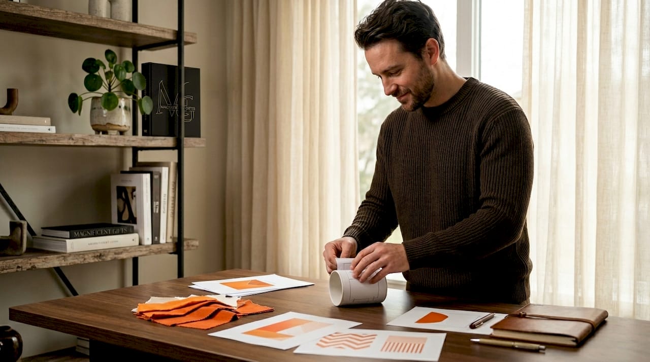
Theory only takes you so far. When your minimalist concept meets a physical mug, production realities require honest attention.
The handle is the first constraint every designer underestimates. The handle interrupts your design field in a way that no flat surface does. It creates an asymmetric boundary that makes centred designs feel optically off. The instinct to place a design dead centre on the wrap often produces something that looks unbalanced in the hand.
Here is a practical workflow for managing these challenges:
- Map your no-go zones. Identify the handle attachment area and leave a minimum buffer of roughly 2 cm on either side. Anything printed close to the handle risks being hidden or visually cut off.
- Keep text short and type weights substantial. Thin scripts and fine serifs lose legibility on curved prints. Strong line weights and short phrases survive the curvature and printing tolerances far better.
- Allow breathing room near edges. A design that reaches to the rim or the base of the mug will feel cramped and risks being clipped during production. Negative space near the edges is not wasted; it is a structural decision.
- Preview at multiple angles. Rotating your design preview 30 to 60 degrees before finalising is the single most effective way to catch balance problems that only appear on the physical object.
- Check contrast against the ceramic base colour. A design that reads clearly on screen can disappear against an off-white or coloured glaze. High contrast between print and background is non-negotiable for minimalist clarity.
Pro Tip: Print your design on paper and wrap it around an actual mug before committing to production. Twenty seconds of this test will reveal alignment issues that digital mockups routinely conceal.
Typography deserves particular attention. Minimalist branding on mugs works best when spacing and type do the heavy lifting rather than ornamental graphics. A single well-chosen typeface at a confident weight, paired with generous surrounding space, will consistently outperform a detailed illustration that fights the curve.
Popular minimalist mug styles and features
The market for minimalist ceramics has developed distinct stylistic directions that are worth knowing if you are designing or curating in this space.
| Style | Key features | Typical audience |
|---|---|---|
| Typographic | Bold single word or phrase, strong weight, monochrome | Gift buyers, design professionals |
| Geometric mark | Simple shape or icon, minimal colour, centred placement | Retailers, lifestyle brands |
| Textural | Raised lines or carved details, no printed decoration | Craft and ceramic collectors |
| Line illustration | Single continuous or minimal line drawing, white space dominant | Musicians, creatives, niche communities |
| Colour-block | Two-tone ceramic, no graphic elements, form as design | Hospitality, premium homeware |
Beyond the table, a few broader trends stand out. Minimalist mug styles increasingly favour tactile details over printed decoration, with raised or carved textures replacing busy graphics. This reflects a wider design culture that values material honesty and craft over reproduction.
Mugnificentdeals has carved out a particularly interesting position within this space by combining line illustration minimalism with music-focused personalisation. The approach keeps the visual field clean while embedding genuine personality through subject matter rather than decorative complexity.
What makes minimalist mugs effective as gifts comes down to one simple truth: a restrained design does not impose on the recipient. It leaves room for their own identity to fill the space. That is not a weakness. It is a considered strength.
Applying minimalist principles in your own designs
If you are ready to create your own minimalist mug, the discipline begins before you open any design software.
- Start with a full inventory. List every element you are considering: text, imagery, colour, decorative details. Then challenge each one to justify its presence. If you cannot articulate why it needs to exist, remove it.
- Work in greyscale first. Colour has a way of masking weak composition. Building your layout in greyscale forces you to rely on form, weight, and spacing before adding tonal decisions on top.
- Respect production constraints from the start. Managing curvature and printing tolerances is not a final step. Knowing your handle zones and edge buffers should shape your composition from the initial sketch.
- Design for emptiness, not just simplicity. Ask yourself whether your design gives the person using the mug room to bring their own meaning. A mug that does not shout its personality is often more beloved over time than one that does.
- Choose materials and finishes deliberately. A matte glaze reads differently from a glossy one. A white ceramic base creates different contrast relationships than a black or coloured one. The tactile and visual quality of the object itself is part of the design.
- Aim for timelessness. Minimalist designs hold their appeal across contexts, seasons, and recipients precisely because they are not anchored to a trend. If your design would still feel right in five years, you are probably on the right track.
Understanding thoughtful mug design as a discipline rather than a style choice is what separates decorators from designers.
My honest take on minimalism in mug design
I have come to believe that minimalism is one of the most misunderstood creative disciplines, particularly in product design. People see a simple mug and assume the designer had little to say. What they are actually looking at is the result of someone who had a great deal to say and chose to say only the most necessary part.
What I find genuinely underappreciated is the creative tension in that restraint. Decoration gives you more surface area to hide behind. Minimalism exposes every decision. A font choice that is slightly wrong, a composition that is fractionally off-centre, a colour that does not quite earn its place: all of these become visible immediately when there is nothing else competing for attention.
The production reality of mugs adds another layer of honest difficulty. I have seen beautifully minimal concepts collapse under the weight of a handle zone miscalculation or a print that lost its fine detail on the curve. The philosophy and the manufacturing reality have to be in conversation throughout the process, not introduced to each other at the end.
What I keep coming back to is the idea that a great minimalist mug becomes yours. It does not announce itself or claim attention. It simply fits into your routine and, quietly, feels right. That quality is what makes these designs genuinely sticky as gifts and as objects. You cannot manufacture that feeling with decoration. You have to earn it through restraint.
— Lasse
Find your sound in simple form

If this exploration of minimalist mug design has sparked something, Mugnificentdeals offers a place where that philosophy meets music and personality. The collections blend clean, line-illustration minimalism with deeply personal touches: instrument drawings, musician humour, and names that make a mug feel made for one person specifically. Whether you are looking for a gift that says something without saying too much, or browsing for inspiration in how simplicity and identity can coexist, the personalised music mugs collection is worth a look. For gifts with shelf appeal, explore the best music mugs for gifts selection too.
FAQ
What is minimalist mug design?
Minimalist mug design is a disciplined approach where every design element, colour, typography, and space must serve a clear purpose. It is not about sparse decoration but about making fewer elements work harder through careful hierarchy and deliberate use of negative space.
How does negative space work in mug design?
Negative space is an active element that controls where a viewer's attention rests. On a mug, generous empty ceramic surface creates the calm, balanced quality associated with minimalist aesthetics rather than leftover area without purpose.
What is the difference between simplicity and emptiness in design?
Western minimalism reduces elements to clarify form or function. Kenya Hara's emptiness instead creates open conditions that invite the user to bring their own meaning, producing designs that feel receptive rather than declarative.
Why do minimalist mugs make good gifts?
A restrained design does not impose a personality on the recipient. It leaves room for the person to make the object their own over time, which tends to produce a longer-lasting emotional connection than heavily decorated alternatives.
What font styles work best on minimalist mugs?
Strong line weights and short phrases survive the curvature and print tolerances of ceramic production far better than thin scripts or fine serif typefaces, which tend to lose legibility on curved surfaces.