A mug is one of the few objects that earns a place in your daily life without question. You pick it up before you are fully awake, wrap both hands around it, and carry it through the morning. That intimacy is exactly what makes clever mug design so worth getting right. Yet most people assume clever means funny, and most designers assume it means decorative. What is clever mug design, really? It is the meeting point of visual storytelling, print practicality, and genuine usability. This guide covers all three, so you walk away with both inspiration and a working understanding of how to make it happen.
Table of Contents
- Key takeaways
- What is clever mug design and why it matters
- Core principles of effective mug design
- Popular themes and creative ideas in 2026
- Choosing the right design approach
- How to create your own clever mug design
- My honest take on what makes a mug design truly clever
- Find your clever mug design at Mugnificentdeals
- FAQ
Key takeaways
| Point | Details |
|---|---|
| Usability comes first | Design must account for handle placement, rim clearance, and daily comfort before aesthetics. |
| Legibility drives impact | Thick fonts, high contrast, and minimal text near edges make designs readable on a curved surface. |
| Minimalism is the 2026 trend | Single line art, one-word slogans, and negative space signal premium quality and deliberate craft. |
| Theme and audience alignment | The strongest mug designs speak directly to a niche identity, whether musical, literary, or humorous. |
| File specs matter enormously | Export at exact dimensions and use preview tools to catch text drift before a single mug is printed. |
What is clever mug design and why it matters
Clever mug design is not a punchline on ceramic. It is the deliberate combination of visual clarity, thematic relevance, and print awareness that makes a design work across the full life of the object. A mug that looks brilliant in a product photo but has text creeping behind the handle, or a gradient that washes out at the base, is not clever. It is a missed opportunity.
Effective mug design focuses on clarity and usability over excessive detail. That principle sounds simple, but it asks you to think about the object before the artwork. What shape is the mug? How does the person hold it? Where does their eye land when the mug is sitting on a desk?
The best mug design concepts answer those questions before a single line is drawn. They work with the object rather than against it. That is the difference between a design that feels thought through and one that merely looks good in a brief.
The role of storytelling in clever design
Beyond print mechanics, clever design tells a story in seconds. A single line drawing of a violin. A short phrase that only a musician would recognise. A layout so considered it communicates care before the owner reads a word. These are the details that turn a practical object into something personal. Storytelling does not require complexity. Often, the most memorable designs are the quietest ones.
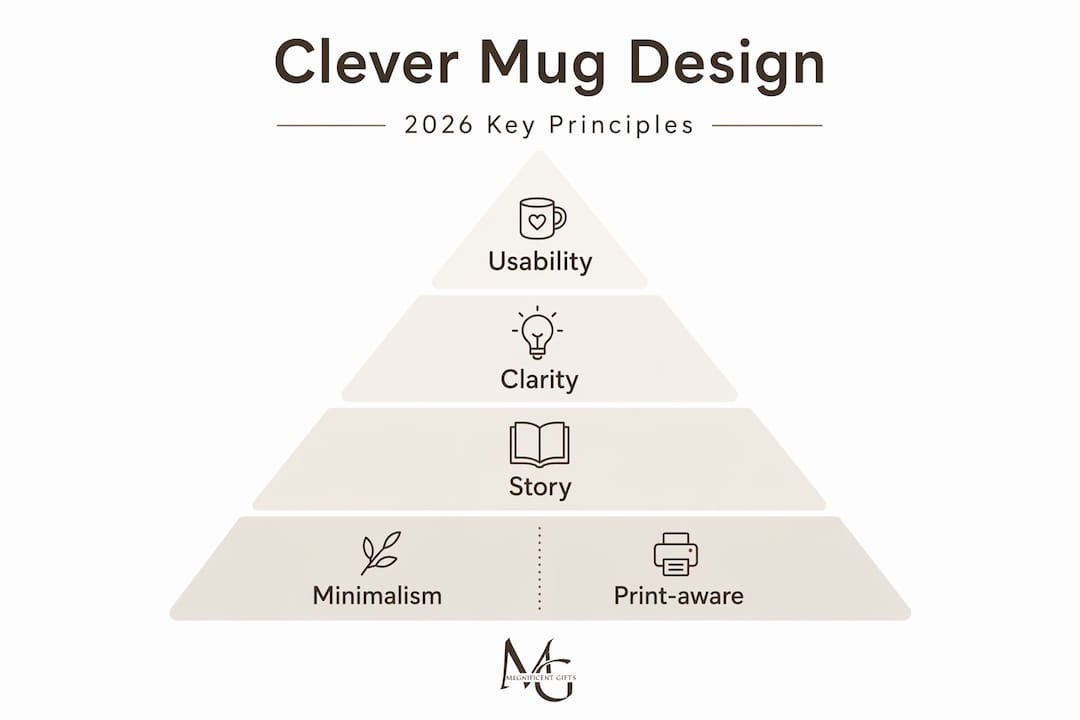
Core principles of effective mug design
Understanding the physical reality of a mug is the foundation of every successful design. Unlike a flat poster or phone case, a mug is a cylinder with a handle, a rim, and a base. Each of those features creates design constraints that must be respected.
Key design elements must be kept 1/8 to 1/4 inch away from handle seams to maintain readability. Ignore that rule and your carefully placed logo drifts into the seam, or your punchline wraps awkwardly around a curve that no one will ever see. Equally, text cramped near the rim or base becomes illegible when the mug is in use because those areas are rarely in the viewer's direct sightline.
Here are the core principles every designer should practise before committing to print:
- Handle zone awareness. Keep all important text and imagery away from the seam area on both sides of the handle.
- Font weight and contrast. Use thick, bold typefaces. Curved surfaces compress letterforms optically, so lightweight fonts lose definition fast.
- Limit the text load. One strong line of copy almost always outperforms three mediocre ones on a mug surface.
- Respect the rim and base. Leave clear margins at the top and bottom of the printable area to avoid distortion and dishwasher wear.
- Resolution and file format. Export files at the exact dimensions required by your printer, typically 300 DPI minimum, using PNG or PDF for clean edges.
Minimalist negative space is the standout trend for 2026, and it aligns perfectly with these constraints. A design that breathes is easier to print accurately and easier for the eye to read at a glance.
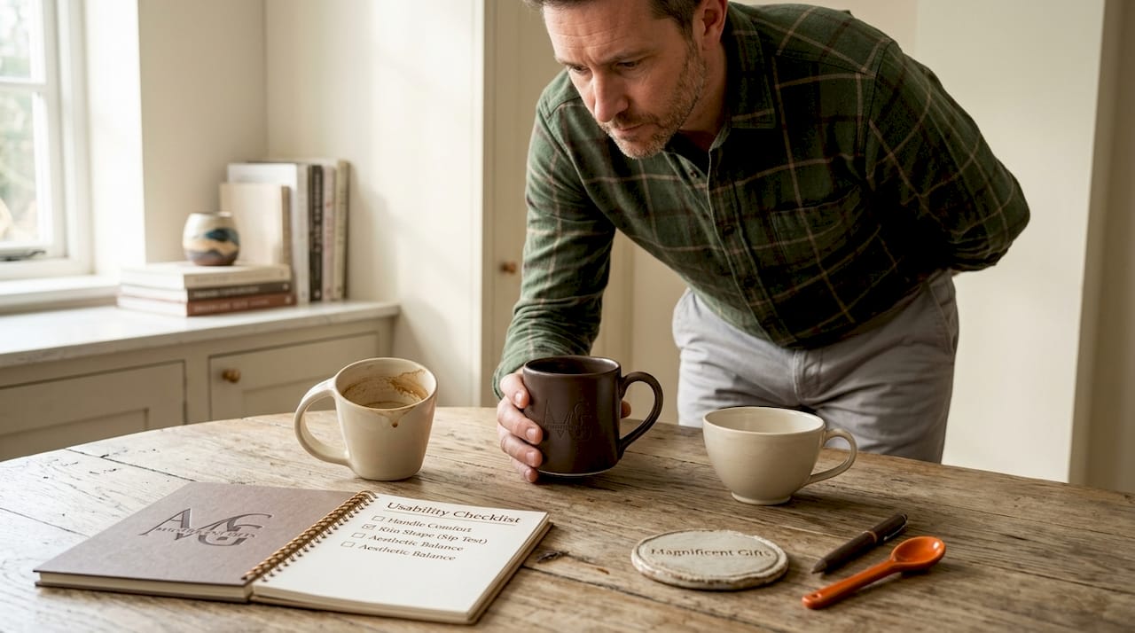
Pro Tip: Before sending your file to print, wrap your design image around a 3D mug preview tool. It takes five minutes and will reveal text drift, handle conflicts, and contrast issues that flat mockups simply cannot show.
Popular themes and creative ideas in 2026
Once you understand the physical rules, the creative possibilities open up considerably. The themes that are performing best in 2026 share one characteristic: they speak to a specific person rather than everyone.
Personalised and niche-themed mugs are the dominant clever design trend this year, with premium designs ranging from £35 to £80 and standard personalised versions accessible at lower price points. That range reflects just how broad the appetite for personalisation has become. People are not buying mugs. They are buying objects that reflect who they are.
The themes generating the most enthusiasm right now include:
- Line art and instrument illustrations. Clean, single-colour drawings of guitars, cellos, pianos, and drum kits carry enormous personality without overwhelming the surface.
- Humorous quotes with precision editing. Funny mug designs work best when the copy is short, bold, and positioned on the front-facing side where it lands immediately. Think: five words maximum, large enough to read across a kitchen.
- Literary and cultural references. A well-chosen quote from a composer, a lyric fragment, or a music theory joke rewards the right reader without alienating anyone else.
- Single-word or one-phrase minimalist designs. "Minimal and clean designs convey premium quality," and this approach dominates the artisan end of the market. One word in a considered typeface can say more than a paragraph.
- Seasonal and occasion-specific designs. Photo mugs and event mugs for birthdays, graduations, and recitals remain evergreen gift choices, especially when they include a name or date.
- Tactile and textured effects. Raised or embossed patterns, glaze variations, and colour-changing thermal designs add a layer of interaction that flat prints cannot replicate.
For gift buyers in the music space, the overlap between personalisation and niche identity is particularly powerful. A mug that says something specific to a violinist feels like it was made for them, because effectively it was. Brands like Mugnificentdeals have built their entire identity around this idea: that a mug should whisper "you belong here" rather than shout for attention.
Choosing the right design approach
Not every design idea suits every mug format. The choice between a one-sided design, a two-sided design, and a full wrap has real consequences for usability and visual impact.
| Design type | Best for | Key consideration |
|---|---|---|
| One-sided (front only) | Bold quotes, single illustrations | Maximum impact on the primary viewing side |
| Two-sided | Brand collections, storytelling pairs | Consistency between both sides is critical |
| Full wrap | Patterns, textures, scenic designs | Central elements must stay clear of handle seams |
For wrap-around designs, key visual elements must be placed centrally and away from edges to avoid distortion and maintain readability from multiple angles. A pattern that tiles beautifully on screen can look chaotic on a cylinder if the repeat has not been tested.
Colour choice also shifts depending on the mug base. White mugs offer the fullest colour range but show fingerprints readily. Black or dark-coloured mugs suit high-contrast, lighter designs and give a premium feel, but they limit the colour palette available for print. Consider also the comfort and washability of the mug itself. A design applied to a poorly shaped handle defeats the purpose regardless of how beautiful the artwork is.
Pro Tip: If your design includes fine linework, test it on both a white and a dark base before committing. Lines that read crisply on white can disappear entirely on a coloured glaze.
Intricate artwork has genuine appeal, but simpler graphics typically hold up better over hundreds of dishwasher cycles. That is a practical argument for minimalism that goes beyond aesthetics.
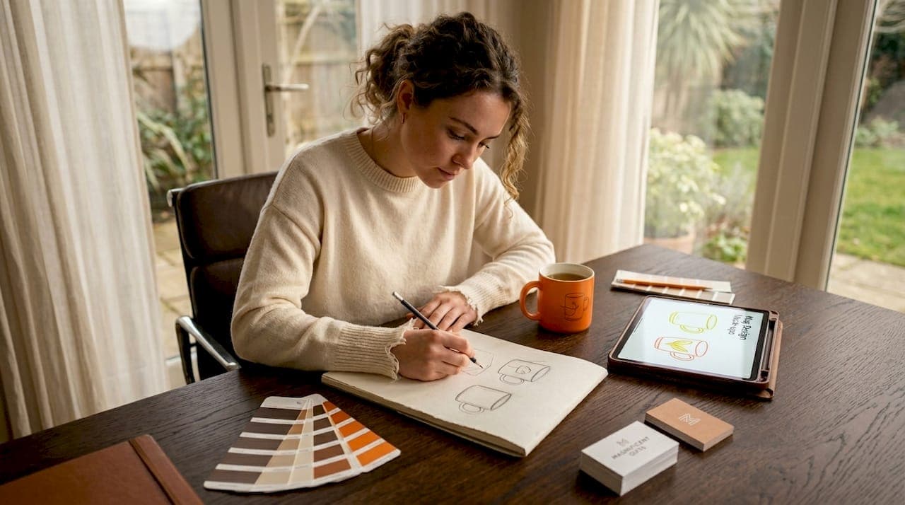
How to create your own clever mug design
Creating a print-ready mug design is a process that rewards patience and a methodical approach. Here is a practical sequence that works whether you are using professional software or a drag-and-drop design tool.
- Choose your mug shape and printable area. Standard 11oz and 15oz mugs have different wrap dimensions. Establish the exact printable area before you open a design file.
- Plan your layout around the handle. Decide whether your design is front-facing or wrap-around. If front-facing, position your strongest element where the eye lands naturally when the mug is held in the right hand.
- Select fonts for legibility, not just style. Opt for medium to bold weight typefaces with clean letterforms. Script fonts can work beautifully in short phrases but fail at small sizes on a curved surface.
- Build your colour palette with contrast as the priority. Two or three colours with strong contrast between the design and the background outperform complex palettes every time.
- Place imagery at the correct resolution. 300 DPI at print size is the standard minimum. Upscaling a low-resolution image to fit a mug wrap produces a blurry result regardless of how sharp it looked on screen.
- Use a mug template or mockup to review your work. Export at exact dimensions and use preview tools to check for text drifting and handle zone conflicts before printing.
- Simplify before you submit. Remove any element that does not add to the core idea. Negative space is not wasted space. It is what gives the central design room to breathe.
For design software, the choice depends on your experience level. Professional tools offer precise control over file specs, but well-built drag-and-drop platforms with mug templates can produce excellent results. The goal is a clean file at the correct dimensions. How you get there matters less than whether you arrive correctly.
Pro Tip: A template-first workflow speeds up simple front-facing designs considerably. For wrap-around or dimensionally complex mugs, start from the printer's exact specifications rather than adapting a template.
Resources like this guide on designing minimal musician mugs offer practical walkthroughs that apply these principles directly to music-themed designs.
My honest take on what makes a mug design truly clever
I have spent a lot of time thinking about what separates a mug design that people actually use from one that ends up at the back of the cupboard. And my honest answer is this: usability beats aesthetics, every single time.
I have seen genuinely beautiful designs rendered useless because the text wrapped into the handle zone, or because the font was so delicate it disappeared after three washes. The mug that survives daily life is the clever one, not the mug that photographs best.
What I have learned is that the most effective designs are built on modular thinking. Using modular branding structures in mug design helps scale product lines with consistency and consumer recognition. A fixed visual framework with interchangeable elements, say a consistent layout with variable instrument illustrations, lets you build a coherent collection without starting from scratch each time.
The 2026 move towards minimalism is not a trend I would dismiss as temporary. It reflects something genuine: people want objects that feel considered, not cluttered. A single line drawing of a cello on a clean white mug is harder to get right than a complex illustrated scene, but when it lands, it stays with the person who holds it.
My advice to anyone designing mugs for themselves, for sale, or as gifts is to start with one strong idea and resist the urge to add to it. Restraint is the mark of confidence in design. The cleverest mug designs are the ones that look effortless, precisely because someone did the hard work of editing.
— Lasse
Find your clever mug design at Mugnificentdeals
If this guide has given you a clearer picture of what makes a mug design genuinely clever, the next step is seeing those principles in action on real products.
Mugnificentdeals has built a collection that applies exactly these ideas: clean line art, music-specific humour, and personalisation that feels intentional rather than generic. Whether you are shopping for a gift or looking for inspiration for your own designs, the personalised music mugs collection is a strong starting point. For gift-focused choices with a bit more curation, the best personalised music mugs for gifts collection narrows down the options further. Every design there has gone through the same process this article describes: clarity, usability, and a story worth telling.
FAQ
What is clever mug design in simple terms?
Clever mug design is the combination of visual storytelling, print-aware layout, and genuine usability that makes a mug both beautiful and practical. It goes well beyond decoration or humour.
Why does handle placement matter in mug design?
Important text and logos must be kept at least 1/8 to 1/4 inch from handle seams to prevent distortion and maintain legibility, as handle zones affect readability on the finished product.
What are the most popular mug design themes in 2026?
Minimalist line art, personalised niche designs, and short humorous quotes are the strongest trends. Personalised and niche-themed mugs dominate the market, with premium options ranging from £35 to £80.
What file format should I use for mug designs?
Export your file as a PNG or PDF at 300 DPI and at the exact print dimensions specified by your printer. Using preview tools before printing helps catch any text drift or handle zone conflicts early.
Are funny mug designs still popular?
Yes, but the most effective funny mug designs are short, bold, and positioned on the primary viewing side. Five words or fewer, in a thick readable font, outperforms longer humorous copy on a curved surface.