
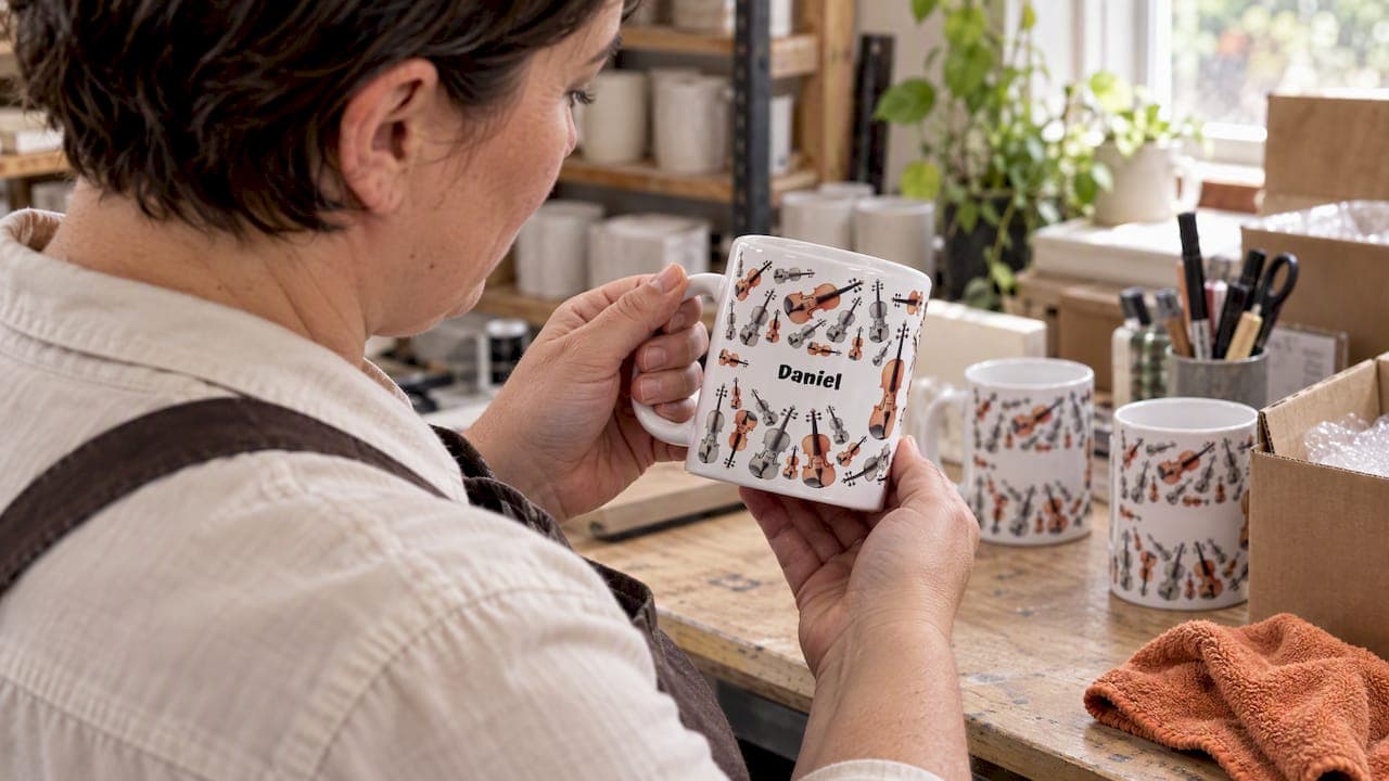
Yes, apostrophes in names on personalised mugs generally print cleanly and look as intended in most cases. The main variable is typography: certain fonts render a thin apostrophe better than others, especially once heat and pressure are applied during printing. If an ordering system flags the punctuation as invalid, a simple fix is to try a straight apostrophe instead of a curly one, or to add a note through special instructions to address the issue manually.
TL;DR:
- Choose bold, clean fonts and dark text on light ceramic; thin decorative scripts, pale colors, and busy backgrounds can make apostrophes fade.
- Check a mockup at actual size and keep the mark away from the handle and print seam, where wrapping can distort or crop it.
- If checkout rejects the punctuation, switch between straight and curly apostrophes, then document the exact spelling in special instructions or contact support.
- Request manual proofing before production for names where punctuation is essential, since automated files leave little time to correct errors once sent to print.
Table of Contents
- How apostrophes are rendered on mugs: typography and printing realities
- Common production limits and order-system validation
- A simple, customer-facing proofing checklist before you order
- Font and design tips for names with apostrophes
- If the site rejects your apostrophe: quick fixes and when to escalate
- A short note on punctuation and proofing
- How we handle apostrophes when you order with us
- FAQ
- Sources
How apostrophes are rendered on mugs: typography and printing realities
An apostrophe is a small, delicate mark, and ceramic printing is not always kind to small, delicate marks. The shape you see on screen (whether a straight vertical stroke or a curved, comma-like curly apostrophe) depends on the font, and that shape carries through to the final print with varying degrees of fidelity.

Bolder, simpler typefaces tend to hold their punctuation better than thin decorative scripts. A heavy sans-serif keeps the apostrophe thick enough to survive the transfer process, while a delicate script can let it thin out until it barely registers against the ceramic surface.
Heat and pressure during printing can fill in or blur fine details, particularly on fonts with narrow strokes. Colour contrast plays a real part here too: a dark apostrophe on light ceramic survives the process far better than a pale mark on a busy background.
- Straight apostrophes generally print with more consistent weight than curly ones on decorative fonts.
- Bold sans-serif typefaces preserve punctuation better than thin script fonts under heat transfer.
- Dark text on light ceramic keeps small marks like apostrophes legible after firing.
- Punctuation placed near the mug handle or the wrap seam is more likely to distort or crop awkwardly.
Pro Tip: If your name includes an apostrophe, ask for a mock-up at actual size rather than a zoomed-in preview, since scaling can hide how thin the mark will really look once printed.
Common production limits and order-system validation
Apostrophes sometimes cause trouble before printing even begins. Many online order systems still struggle with punctuation in text fields, a problem that has existed for years across e-commerce and government databases alike, as reported in coverage of apostrophe-related input errors. Older validation rules or poorly configured database fields can reject the character outright or strip it silently.
- Legacy input validation may block special characters, including apostrophes, before an order is even submitted.
- Automated personalisation workflows map your text directly to a production file, and once that file is sent to print, the correction window closes quickly.
- Removing the apostrophe is a reasonable short-term workaround if a system will not accept it, but it should never be the final answer if the mark is essential to how the name is spelled or recognised.
If an apostrophe matters to you, the safest move is to flag it directly rather than quietly dropping it and hoping nobody minds.
A simple, customer-facing proofing checklist before you order
A few minutes of checking before you confirm an order prevents almost every punctuation mishap we see.
- Confirm the exact spelling of the name, including the position of the apostrophe, and check it against any character limits for names on the product you have chosen.
- Pick a clear, legible font and view the mock-up at its true printed size rather than a magnified preview.
- Avoid placing the apostrophe right where the design wraps around the handle or meets the print seam.
- If precise punctuation is non-negotiable, use the special-instructions field at checkout or ask for a manual proof before production starts.
Pro Tip: Zoom out on your mock-up until it matches the mug's actual width, since punctuation that looks fine enlarged can disappear at true scale.
Our guide on checking mug quality before buying covers what to look for in a proof beyond just spelling.
Font and design tips for names with apostrophes
Music-themed designs often lean on expressive lettering, but punctuation needs a little extra room to survive that style intact.
- Choose a bold, clean sans-serif or a sturdy hand-lettered script rather than an ultra-thin decorative font.
- Add slightly wider kerning around the apostrophe so it does not visually merge with the letters on either side.
- Keep text in high contrast against the mug's background colour, since faint marks are the first detail to fade under heat.
- Lean on instrument sketches and music-note motifs as the decorative focus, letting the name itself stay simple and legible.
Some sketch-style designs are built with this balance in mind: bold outlines and clear lettering so punctuation like apostrophes stay crisp rather than disappearing into a busy illustration. For browsing names other customers have chosen, our musician mug name ideas page is worth a look before you commit to your own layout.
If the site rejects your apostrophe: quick fixes and when to escalate
If an apostrophe gets flagged or stripped during checkout, there is usually a quick fix before you need to contact anyone.
- Try switching between a straight apostrophe and a curly one, then recheck the live preview, since some fields accept one character but not the other.
- Use a space as a temporary placeholder only, and note the exact punctuation you want in the special-instructions field so it is not forgotten.
- Reach out to customer support early, especially if the apostrophe is part of a stage name, nickname, or family surname where getting it right really matters.
Our printing methods overview explains why some techniques handle fine punctuation differently, which is useful background if you are choosing between product lines.
A short note on punctuation and proofing
Getting a name right matters more than it might seem, especially when that name is going on a gift for someone's favourite instrument or inside joke. We built our proofing steps around exactly that concern: catching spelling and punctuation issues before anything goes near a heat press, not after. Our 5 Step Proofing for British Spelling on UK mugs walks through the same checks we apply internally, so you can see what we are looking for before you place an order.
— Lasse
How we handle apostrophes when you order with us
Apostrophes in names are accepted across personalised ranges, and where a name needs careful typographic handling, manual proofing may be offered instead of automated templates.

- Browse our personalised music mugs collection to see instrument sketches, name layouts, and font options.
- Request a manual proof at checkout, or mention the apostrophe in special instructions so our team checks it before printing.
- For a cross-category example of hand-checked proofing, Custom Candle Co describes a similar proof-by-hand process for personalised candles.
If your gift recipient's name includes an apostrophe, place your order and flag it, and we will make sure it reaches the mug the way you intended.
FAQ
Are apostrophes accepted in names on personalised mugs?
Yes, apostrophes are generally accepted and print without issue on most personalised mugs, including names like O'Connor or D'Angelo. The main consideration is font choice, since bold, high-contrast lettering preserves the mark better than thin decorative scripts.
Why would an apostrophe get rejected during online ordering?
Some older order-validation systems and databases are not configured to accept apostrophes, a longstanding issue across various online forms and databases. When this happens, trying a straight apostrophe instead of a curly one, or contacting support directly, usually resolves it.
Will my apostrophe look the same on the mug as on screen?
It should be close, but heat transfer printing can slightly alter fine details like thin punctuation marks. Checking a true-to-size mock-up and requesting a manual proof for punctuation-critical names reduces the chance of any surprise.
Can I fix a rejected apostrophe without contacting support?
Sometimes, by switching between apostrophe styles or rechecking the preview after a small edit. For anything where the punctuation is essential to the name's identity, flagging it to support directly is the more reliable route.
Is my product information covered by consumer protection law?
In the UK, information a trader gives about a product's main characteristics is treated as part of the contract under the Consumer Rights Act 2015. That means descriptions of how personalisation will appear are something you can reasonably rely on when ordering.