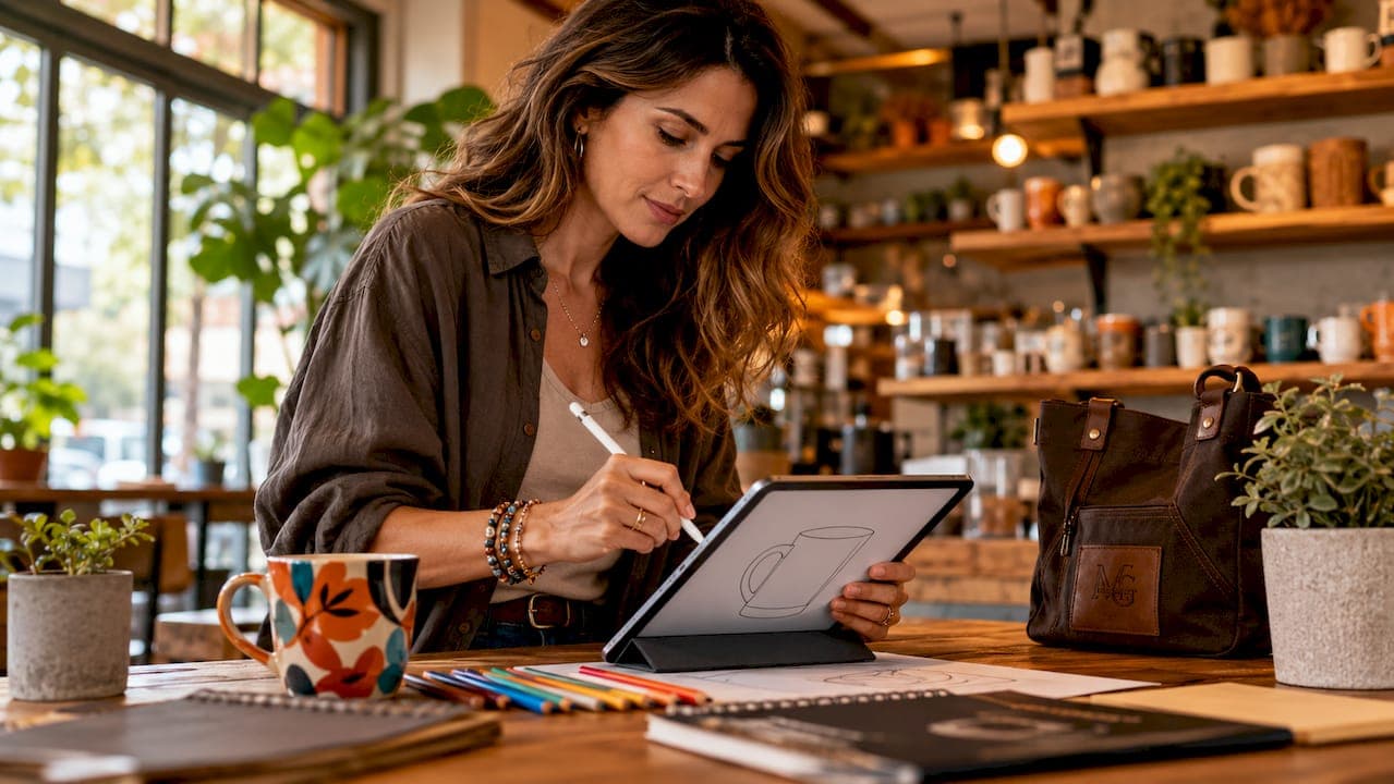
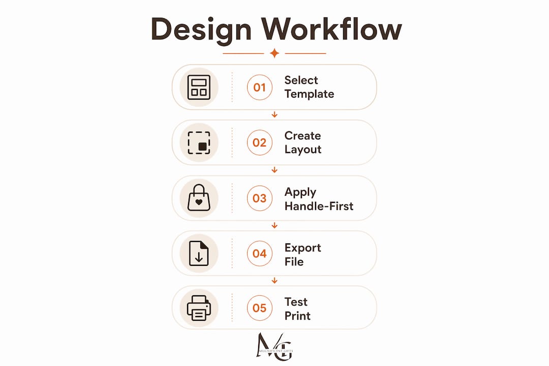
A structured music teacher mug design workflow is defined as the ordered process of selecting templates, placing artwork, and exporting print-ready files that translate accurately onto curved ceramic surfaces. The most effective approach starts with a manufacturer-specific template and applies "handle-first" logic before a single graphic element is placed. Tools like Canva, Adobe Express, and Photopea each support this process, but the workflow itself determines whether your design looks intentional or accidental. Get the sequence right and you avoid the two most common failures: text drifting into low-visibility zones and exports that pixelate at print size.
What tools and templates are essential for mug design?
The right software and template combination is the foundation of any teacher mug design process. Without a manufacturer-specific template, you are essentially designing blind.
Recommended design software
Each of these tools suits a different skill level and budget:
- Canva — browser-based, beginner-friendly, with drag-and-drop mug templates built in
- Adobe Express — strong for typography-led designs; integrates well with Adobe Illustrator assets
- Photopea — free, browser-based Photoshop alternative; ideal for layered PSD templates
- GIMP — open-source desktop software with full layer and bleed control
- Figma — excellent for teachers designing class sets, as it supports reusable components and shared files
Template requirements
| Template Feature | Why It Matters |
|---|---|
| Bleed margin (3–5 mm) | Prevents white edges appearing after trimming |
| Safe zone boundary | Keeps text and key graphics away from cut lines |
| Handle zone marker | Flags low-visibility areas near the handle |
| Correct dimensions | Standard 11oz mug wrap is typically 8.5 × 3.7 inches |
Using printer-specific templates as locked backgrounds is the single most reliable way to prevent cropping errors. Locking the template layer means you cannot accidentally move it while editing artwork above it.
For hardware, the Cricut Mug Press is a popular choice for small-batch production at home. It applies sublimation transfers to 11oz and 15oz mugs with consistent heat and pressure. Pair it with a crafter's template guide to understand how bleed and safe zones translate from screen to ceramic.
Pro Tip: Download the template provided by your specific print supplier, not a generic one. Dimensions vary between suppliers, and a mismatch of even a few millimetres causes misaligned artwork.
How does "handle-first" logic improve your mug layout?
"Handle-first" layout is the practice of marking low-visibility zones near the mug handle before placing any text or graphic elements. It is the single most overlooked step in the creative mug design process for educators.
Here is how to apply it correctly:
- Open your locked template. Identify the handle attachment area, typically marked as a shaded or hatched zone on manufacturer templates.
- Mark the low-visibility zones. Mark these handle zones clearly on the template before adding any artwork. Anything placed here will be obscured when the mug is held or displayed on a shelf.
- Choose your focal point. Decide on one primary element: a teacher's name, a musical note motif, or a short phrase like "I improvise, not mistakes." One focal point reads clearly; three compete.
- Position key elements in the safe zone. Place names, instrument illustrations, and main text in the central third of the wrap, well away from handle zones and bleed edges.
- Plan secondary elements. If you are designing a full wrap, use the back half for supporting graphics or a secondary message. Keep it lighter in visual weight than the front.
- Test the composition on a flat preview. Before moving to a 3D mockup, confirm that no critical text sits within 10mm of any edge or handle zone.
Designs that look good on flat screens can lose visibility due to curvature and handle placement. This is not a minor issue. A teacher's name printed beautifully on screen can become half-hidden behind a handle in real life.
Pro Tip: Rotate your flat design preview 30–60 degrees in your design software to simulate how the mug will look from a natural drinking angle. This catches handle-zone problems before you commit to print.
How do you create and export print-ready mug design files?
The print-ready export stage is where most amateur designs fail. Follow this sequence to produce files that print sharply without pixelation or unexpected cropping.
- Start on a locked background template. Starting with a locked background template ensures artwork fits within print-ready margins from the outset.
- Build typography with readability in mind. Bolder fonts and increased letter spacing improve text legibility on curved ceramic surfaces. Use medium-to-bold weights and avoid condensed typefaces. A minimum font size of 14pt is a reliable baseline for 11oz mugs.
- Check colour contrast. Ceramic sublimation printing shifts colours slightly. Dark text on a light background, or white text on a deep colour, produces the most reliable results. Avoid light grey on white or pastel on pastel.
- Export at 300 DPI. 300 DPI is the standard requirement for print-ready files to prevent pixelation on curved drinkware. Export as PNG for transparency support or PDF for professional print submissions.
- Match dimensions exactly. Export files exactly matching required dimensions without scaling. Never use "fit to page" settings, as these introduce subtle distortions that only become visible after printing.
- Inspect at 100% zoom. Open the exported file and zoom to 100%. Check that text edges are crisp, not blurry, and that no element has been clipped by the canvas boundary.
| Common Export Mistake | Consequence | Fix |
|---|---|---|
| Exporting below 300 DPI | Pixelated text and graphics on ceramic | Set canvas resolution before starting |
| Using "fit to page" scaling | Cropped edges or distorted proportions | Export at exact template dimensions |
| Missing bleed area | White border visible after trimming | Extend background colour into bleed zone |
| Saving as JPEG with compression | Colour banding and artefacts | Use PNG or PDF for final export |
Pro Tip: Save a separate "master" source file with all layers intact. If a student's name needs changing for a class set, you update one text layer rather than rebuilding the entire design.
Creative music mug design ideas tailored for teachers
The best teacher mug designs share one quality: they feel personal without being cluttered. Here are the most effective approaches for artistic mug design for educators.
- Minimalist typography. A single bold phrase like "Conductor of Chaos" or a teacher's name in an elegant serif font, centred on a clean background, reads beautifully on ceramic. Less is genuinely more on an 11oz surface. Explore minimal musician mug design for practical examples of this approach.
- Instrument line drawings. Black-and-white illustrations of violins, grand pianos, or French horns add visual character without overwhelming the composition. They pair well with a single line of text below or above.
- Teacher appreciation phrases. Short, witty messages resonate strongly. "I don't make mistakes, I improvise" or "Fortissimo before coffee" connect immediately with music educators and make print on demand music mugs genuinely giftable.
- Name personalisation for class sets. Designing a set of mugs for a music class? Use a consistent background colour and instrument motif, then swap only the student's name per mug. Personalised musical mug messages that feel specific to the recipient make the gift memorable rather than generic.
- Negative space as a design tool. Intentional simplification with one focal element and ample negative space improves legibility and aesthetic appeal on smaller mugs. Resist the urge to fill every corner.
The most effective creative mug designs for educators balance two things: a clear visual identity and enough white space for the eye to rest. Think of the mug surface as a small poster, not a noticeboard.
How do you preview, troubleshoot, and finalise your designs?
Finalising a design means more than approving it on screen. A thorough review process catches problems that only appear on a curved surface.
- Use a 3D mockup tool. Preview designs in mockup tools that allow rotation to verify alignment, seam placement, and handle-side visibility before ordering prints. Rotating the preview 30–60 degrees confirms balance and readability from a natural holding angle.
- Check for text drift. Text placed near the edges of a flat template can appear to drift towards the handle or base once wrapped around a cylinder. If a preview shows this, move the element towards the centre of the safe zone.
- Simplify if in doubt. If the mockup looks busy, reduce the number of text lines by one and increase the font weight. This almost always improves the result.
- Organise your files for reorders. Maintaining a source layout file for all assets prevents version control issues and ensures consistent element placement across multiple mugs. Label files clearly: "MrsSmith_MusicMug_v2_FINAL.png" is far more useful than "mug_export_new.png".
- Avoid thin border frames. Thin decorative borders amplify any slight misalignment during printing. Rely on balanced negative space instead for a professional finish.
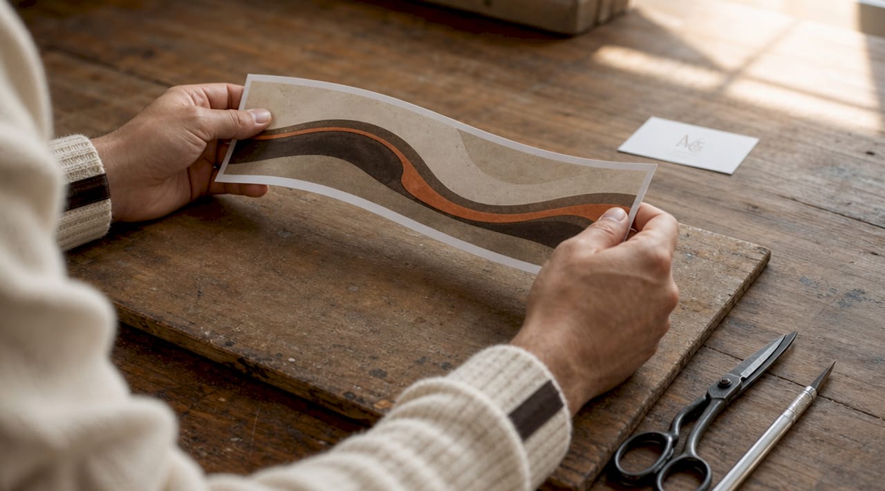
Pro Tip: Before submitting to a print supplier, send yourself a test print on paper at actual mug-wrap dimensions. Tape it around a mug and check it physically. This takes five minutes and catches issues that no screen preview will reveal.
Key takeaways
A reliable music teacher mug design workflow depends on three non-negotiable foundations: a manufacturer-specific template, handle-first layout logic, and a 300 DPI print-ready export.
| Point | Details |
|---|---|
| Start with the right template | Use a supplier-specific template with bleed margins and a handle zone marker before placing any artwork. |
| Apply handle-first logic | Mark low-visibility zones near the handle before positioning names, text, or musical graphics. |
| Export at 300 DPI | Always export as PNG or PDF at 300 DPI and exact template dimensions to prevent pixelation and cropping. |
| Prioritise one focal point | Choose a single primary element and use negative space generously to keep the design clear on a curved surface. |
| Maintain a master source file | Keep a layered source file for every design to simplify batch personalisation and future reorders. |
Why structured workflows changed how i think about mug design
When I first started designing mugs for music teachers, I treated the process like designing a flat poster. I chose a nice font, dropped in a treble clef, added a name, and exported. The results were technically printable but frequently disappointing. Text sat too close to the handle. Fonts that looked elegant on screen became hard to read once wrapped around a cylinder. One batch of twelve mugs for a school music department came back with the teacher's surname half-hidden behind the handle on every single one.
The shift happened when I started treating the mug surface as a three-dimensional object from the very first step, not as an afterthought at the preview stage. Marking the handle zones before touching any design element felt counterintuitive at first. It felt like drawing the fences before the garden. But it is precisely that constraint that produces better creative decisions. When you know where you cannot place things, you become more deliberate about where you can.
The other lesson that took longer to learn was the value of simplicity. Music educators often want to include an instrument, a name, a subject, a phrase, and a decorative border. Each element is reasonable on its own. Together, they compete. The mugs that resonate most, the ones that get photographed and shared, tend to have one strong idea executed with confidence and space around it.
If you are designing your first set of custom music teacher mugs, resist the temptation to fill the canvas. Trust the negative space. Trust the bold font. And always, always check the handle zone before you export.
— Lasse
Find your perfect music teacher mug at Mugnificentdeals
Mugnificentdeals designs personalised music mugs that feel sketched and thought-out rather than mass-produced. Every design in the collection reflects the kind of intentional simplicity this article describes: one strong idea, the right typography, and enough space for the design to breathe.
Whether you are looking for a ready-made gift for a music educator or a starting point for your own personalisation ideas, the personalised music mugs collection covers everything from instrument illustrations to teacher appreciation phrases. For gift-specific options, browse the best music mugs for gifts selection, curated for occasions where the mug needs to feel genuinely personal. Orders are fulfilled with care, and the team at Mugnificentdeals is available to help with any custom requests.
FAQ
What resolution should mug design files be exported at?
Export all mug design files at 300 DPI. This is the standard requirement to prevent pixelation on curved ceramic surfaces during sublimation printing.
What is "handle-first" layout in mug design?
Handle-first layout means marking the low-visibility zones near the mug handle before placing any text or graphics. This prevents key elements such as a teacher's name from being obscured when the mug is held or displayed.
Which software is best for designing custom music teacher mugs?
Canva and Adobe Express are the most accessible options for beginners. Photopea and GIMP offer greater layer control for more complex designs, while Figma suits batch personalisation for class sets.
How do i avoid text looking distorted on a curved mug?
Use medium-to-bold font weights with increased letter spacing, and position all text within the central safe zone of the template. Preview the design in a 3D mockup tool, rotating it 30–60 degrees to check readability from a natural angle.
What file format should i use for mug print submissions?
PNG is the preferred format for designs with transparent elements. PDF is standard for professional print submissions. Both formats preserve colour accuracy and sharpness better than JPEG.