Most people reach for their morning mug without a second thought. Yet the role of creativity in mug design goes far deeper than a pretty pattern on ceramic. A well-designed mug carries emotion, tells a story, engages your fingertips, and even shapes how your coffee tastes. This article explores the full creative picture: from the psychology of human expression and the science of tactile perception, to the practical geometry every mug designer must respect. Whether you are an artist, a designer, or simply someone who cares about the objects in their life, what follows will change how you see that cup in your hands.
Table of Contents
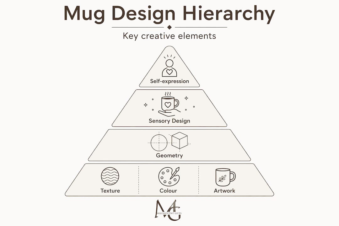
- Key takeaways
- Creativity, emotion, and cultural expression
- How sensory design shapes the mug experience
- Working within mug geometry
- Creative mug concepts beyond the surface
- My take: why mug design deserves serious creative attention
- Bring your creative vision to life
- FAQ
Key takeaways
| Point | Details |
|---|---|
| Mugs as emotional canvases | Creative mug design carries cultural narrative and personal identity far beyond surface decoration. |
| Colour shapes taste | Mug colour influences perceived coffee flavour through crossmodal perception, making palette choices a sensory decision. |
| Texture wavelength matters | Spacing between tactile surface features affects mechanoreceptor response more than embossment height alone. |
| Geometry constrains creativity | Handle placement and wrap edges create design zones that require deliberate artistic problem-solving. |
| Interactive design adds lasting value | Thermochromic and sustainability-driven concepts extend creative value through every use cycle. |
Creativity, emotion, and cultural expression
There is a common assumption that mug design is a graphic design task. You pick a font, drop in an illustration, and call it done. That view misses something fundamental. Creativity in this context is a deeply human act, one that defines identity and culture in ways that no automated process can replicate.
RISD president Crystal Williams has articulated this clearly. She argues that while artificial intelligence can generate visual facsimiles, it cannot replicate the genuine human imagination that gives a creative work its emotional weight. Applied to mug design, this means the best pieces are not just attractive. They carry a viewpoint, a memory, a cultural reference, or a joke that lands because a human being knew it would.
"Human creativity isn't just about making things — it's about making meaning." Crystal Williams, President, RISD
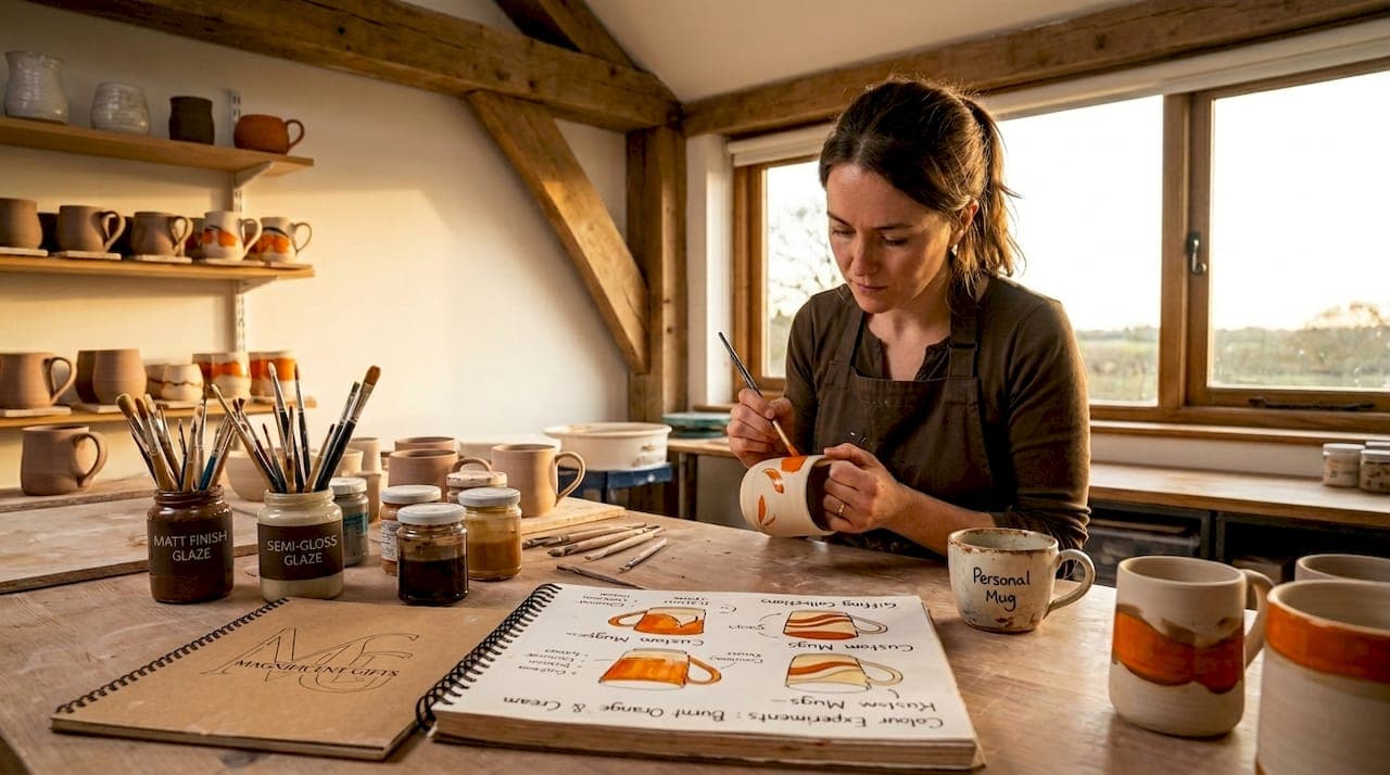
This distinction matters enormously for artists working in the mug space. The role of mugs in self-expression is not decorative. It is communicative. A musician who reaches for a mug featuring their instrument, drawn in a way that feels sketched and personal rather than mass-produced, experiences a micro-moment of recognition. That experience is the result of deliberate creative choice, not algorithmic output.
The history of personalised mugs shows how this impulse towards self-expression through ceramics runs deep, particularly among musicians and artists who seek objects that reflect their identity. For designers, the practical implication is straightforward: every creative decision on a mug should carry intention. The colour, the line weight, the wit in a caption. All of it contributes to a cultural story that the object tells on behalf of its owner.
Pro Tip: Before you begin any mug design, write down one sentence describing the emotional experience you want the user to feel when they first see it. That sentence becomes your creative brief.
How sensory design shapes the mug experience
The importance of creativity in design reaches well beyond what the eye can see. Two dimensions of sensory experience — touch and taste — are directly shaped by the creative choices a designer makes, and both are grounded in measurable science.
Texture and tactile sensation
Research on surface texture reveals that wavelength affects mechanoreceptors more than the height of surface features does. Specifically, textures whose spacing aligns with the natural ridge geometry of a fingerprint produce a heightened and more pleasurable tactile response. This has direct implications for mug design. A matte glaze with fine, evenly spaced texture ridges will feel more satisfying to hold than a deeply embossed surface with irregular spacing, even if the embossed version appears more dramatic visually.
The practical lesson for designers is that texture spacing, not height, is the variable worth testing when aiming for tactile appeal. Prototyping matters here. A design that feels refined in the hand can elevate an ordinary morning into a small sensory ritual.
Colour and perceived flavour
This is where creative mug concepts venture into genuinely surprising territory. Research on crossmodal perception has established that mug colour alters taste perception in measurable ways. Participants in studies consistently rated coffee as more bitter and intense when served in a white mug compared to a blue or transparent vessel. Warmer palettes tend to be associated with sweetness and comfort, while cooler tones shift perception towards sharpness.

For artists, this reframes the entire palette selection process. Choosing the colour of a mug is not simply an aesthetic decision. It shapes the sensory experience of everyone who uses it. A cream-coloured mug with warm amber tones is not just visually cosy. It is, in a meaningful sense, making the coffee taste different.
| Design choice | Sensory impact | Practical application |
|---|---|---|
| Cool blue or grey tones | Increases perceived bitterness | Consider for dark roast or espresso enthusiasts |
| Warm cream or amber | Softens perceived intensity | Suited to everyday coffee drinkers and comfort seekers |
| Fine-spaced surface texture | Heightens tactile pleasure | Prototype spacing before committing to final glaze |
| Deeply irregular embossing | Can reduce tactile comfort | Use sparingly as an accent rather than full coverage |
Pro Tip: When selecting a colour palette for a mug design, brew a cup of your intended user's favourite coffee and hold paint swatches next to it. The visual relationship between the drink and the vessel is part of the design.
Working within mug geometry
Every designer who moves from flat surfaces to cylindrical forms encounters a humbling truth: the mug handle changes everything about artwork placement. Understanding this constraint is not a limitation on creativity. It is the challenge that separates thoughtful mug designers from those producing technically flawed work.
Here is the practical process for working within those constraints:
-
Identify the visual front. The area directly opposite the handle is where most viewers will naturally look first. This is prime real estate for your focal image, key typography, or signature illustration. Treat it as the composition's anchor.
-
Establish no-go zones. Leave a minimum buffer of 10 to 15mm from the handle attachment point on either side, and from the rim and base edges. These areas are prone to print drift, glaze pooling, and mechanical stress during use.
-
Test at multiple rotations. Designers are advised to review layouts at 30 to 60 degree rotations to confirm that critical visual elements do not slide under the handle zone or become obscured at the angles most commonly seen in use. A mug sitting on a desk at a slight angle is the most common real-world viewing position.
-
Balance the wrap deliberately. A design that looks compelling directly facing you but creates a visually dead zone on the reverse is a missed opportunity. Consider whether secondary elements, a pattern, a repeating motif, or a secondary message, can carry the composition around the full cylinder.
-
Account for print method limitations. Some production methods lose fine detail near the handle seam. If your design relies on thin linework or small text, position these elements away from the seam and test with your specific printer before committing to a full run.
This is how creativity affects mug design at a technical level. The best mug artists do not fight the geometry. They design with it, using the cylindrical canvas as a feature rather than an obstacle.
Pro Tip: Print a flat mockup of your wrap design and tape it around a plain mug. Walk around it slowly. What you see in that test is far closer to the real-world experience than any flat screen preview.
Creative mug concepts beyond the surface
The most forward-looking creative mug concepts push past graphics entirely and embed function, behaviour, and environmental awareness into the design itself.
-
Thermochromic designs. Temperature-sensitive inks change colour as the mug heats up, creating a dynamic visual experience that transforms with each pour. Researchers have explored how thermochromic mugs communicate sustainability data at the point of use, displaying carbon footprint information or simple visual cues that encourage eco-conscious behaviour. A mug that responds to heat is not a gimmick. It is a piece of functional art that creates a new moment of connection every single morning.
-
Usage-cycle storytelling. Rather than designing for a single visual impact, some designers are thinking about how a mug's appearance evolves over hundreds of uses. Glazes that develop character with age, designs that reward close inspection after the patina of daily use settles in. This approach treats creativity as something that unfolds over time rather than arriving fully formed.
-
Sustainable design cues. The role of mugs for creative people increasingly intersects with environmental values. Designs that reference natural materials, feature honest imperfections, or explicitly communicate sustainable production choices resonate with audiences who want their objects to reflect their ethics as well as their tastes. Behaviour-driven design in creative objects like mugs creates a genuine opportunity to reinforce environmental consciousness through daily ritual.
-
Tactile storytelling. Raised braille-adjacent patterns, textured musical notation, or embossed instrument outlines turn a mug into something read by touch as much as sight. For musicians and artists, this is particularly resonant. The mug becomes an object of sensory dialogue, not just visual display.
-
Inside-the-mug moments. Printing on the interior base creates a private reward for the drinker. A punchline revealed at the bottom of the cup, a motivational phrase that appears once the coffee is gone, or a small illustration that only the drinker ever sees. These details exemplify how unique mug design ideas thrive on intimacy and surprise.
My take: why mug design deserves serious creative attention
I have spent years observing how people interact with the objects on their desks and in their hands. What I have learnt, and what most designers overlook, is that mugs occupy a uniquely privileged position in daily life. They are touched before almost anything else in the morning. They sit in peripheral vision for hours. They are offered to guests as a subtle expression of taste.
In my experience, the designers who treat mug work as a lesser form of product design consistently produce work that feels generic, even when technically accomplished. The ones who treat it as a legitimate art form, who think about what it feels like in the hand at 6am, what the colour does to the drink, how the illustration holds up after the thousandth wash, produce work that people genuinely treasure.
What I find most exciting right now is the convergence of tactile science, crossmodal perception research, and sustainability-driven creativity. We are moving towards a moment where a well-designed mug is not just an expression of visual taste but a full sensory object designed with the same rigour as a piece of furniture or a musical instrument. For artists who care about craft, that is a genuinely thrilling space to work in.
— Lasse
Bring your creative vision to life
At Mugnificentdeals, creative mug concepts are not theoretical. Every design in the collection reflects the kind of intentional, personality-driven artistry this article has explored, from sketch-style instrument illustrations to clever musical in-jokes that earn a genuine smile. The brand's personalised music mugs bring together everything that makes a mug worth keeping: deliberate design, personal relevance, and the kind of quiet humour that makes an object feel like it was made for you specifically.
Whether you are looking for a gift that speaks to a musician's identity or treating yourself to a mug that reflects your own creative sensibility, Mugnificentdeals offers a range worth exploring. Browse the best personalised music mugs for gifts and discover designs that treat the everyday coffee moment as the small, meaningful creative event it deserves to be.
FAQ
What is the role of creativity in mug design?
Creativity in mug design transforms a functional object into a carrier of emotion, identity, and sensory experience. It shapes everything from colour-driven taste perception to tactile surface quality and personal storytelling.
How does mug colour affect the coffee drinking experience?
Research shows that colour alters perceived taste through crossmodal perception. White mugs make coffee taste more bitter and intense, while warmer-toned mugs soften the perceived flavour.
Why does mug handle placement matter for designers?
The handle defines the visual front of a mug and creates zones where artwork can become obscured or distorted. Keeping key design elements away from handle boundaries and testing layouts at multiple rotations protects both legibility and visual impact.
What are thermochromic mugs and why are they creatively significant?
Thermochromic mugs use temperature-sensitive inks that change colour when heated. Beyond the visual effect, they can communicate sustainability cues and create an interactive narrative that reinforces the mug's creative and ethical identity.
How does surface texture influence how a mug feels to hold?
Texture wavelength affects tactile sensation more than embossment depth. Spacing surface features to align with fingerprint ridge geometry produces a more satisfying and pleasurable tactile response during use.